Tuesday, February 18, 2014

Artsy Book Club: Week 2 (Plus)

We are well into week 3 at this point, but I've been spending my time trying to catch up. 
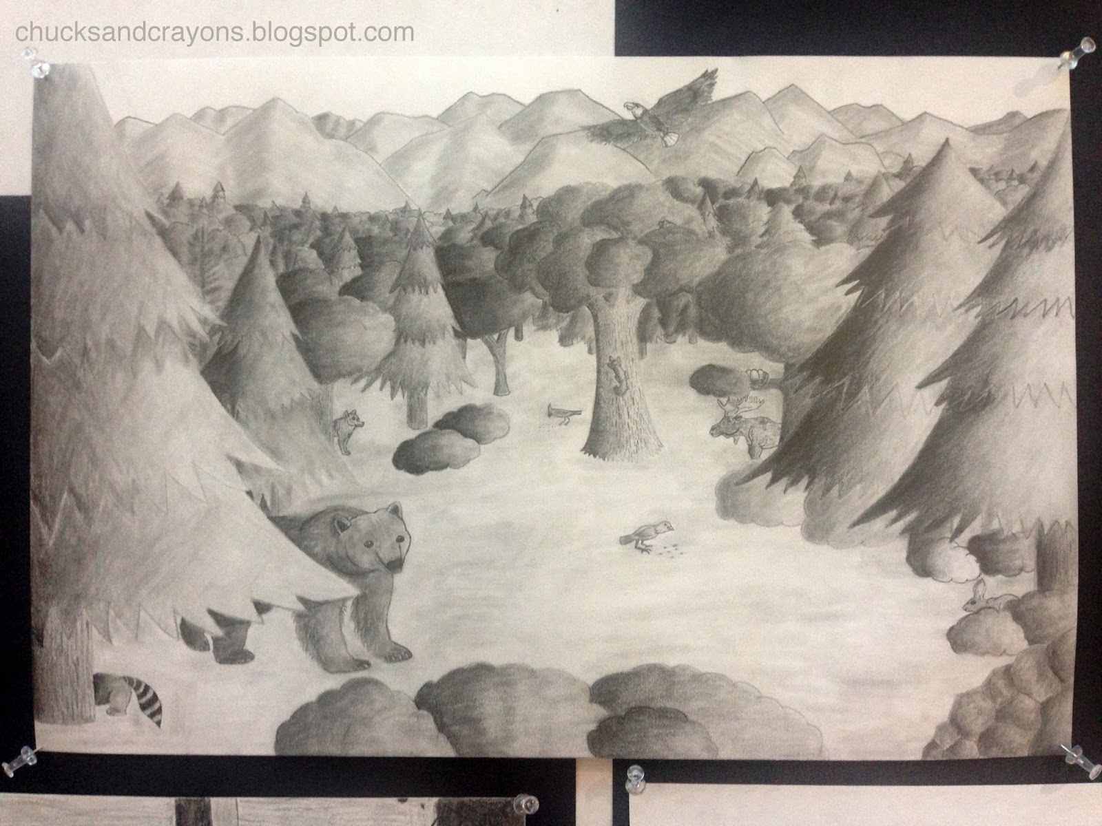
I spent so much time, and was totally rejuvenated after drawing number 4 below. I was back in my comfort zone working with charcoal! But because I spent over an hour on this drawing and was pretty tired, it took me a couple of days to pick up again.


The next drawing, I think, was supposed to be some sort of garden. Its winter here in the north east, so I selected a photo of a piece of drift wood we found on Nantucket that I've always wanted to paint or draw. I wasn't supposed to erase, but I was in the zone of adding a tone and cutting into it after the charcoal drawing, so this is the same method, but with graphite.


Next was supposed to be a garden scene with pen and ink, but again, I'm in the  north east with more and more snow. (Three storms just this week!) This is what it looked like outside my classroom. Cat tails, practice field, street, followed by a hillside graveyard. Yuck.


Day 8 was a pencil, charcoal and ink drawing of family members. I think others did one portrait of the same person. I decided to do three... and timed myself to spend only thirty minutes, even though I could have definitely spent more...

pencil

charcoal

pen (I've given up on ink)

If I learned anything from these portraits, its that we are totally related. I did a quick portrait a couple of months ago... The older I get, the more I see how much my mom and I look alike.


Finally we broke into color.

Tracing our hand and adding symbols, letters, numbers, etc that represent the artist. I had fun with the crayons. Normally I don't like using them, but I think they worked well here.
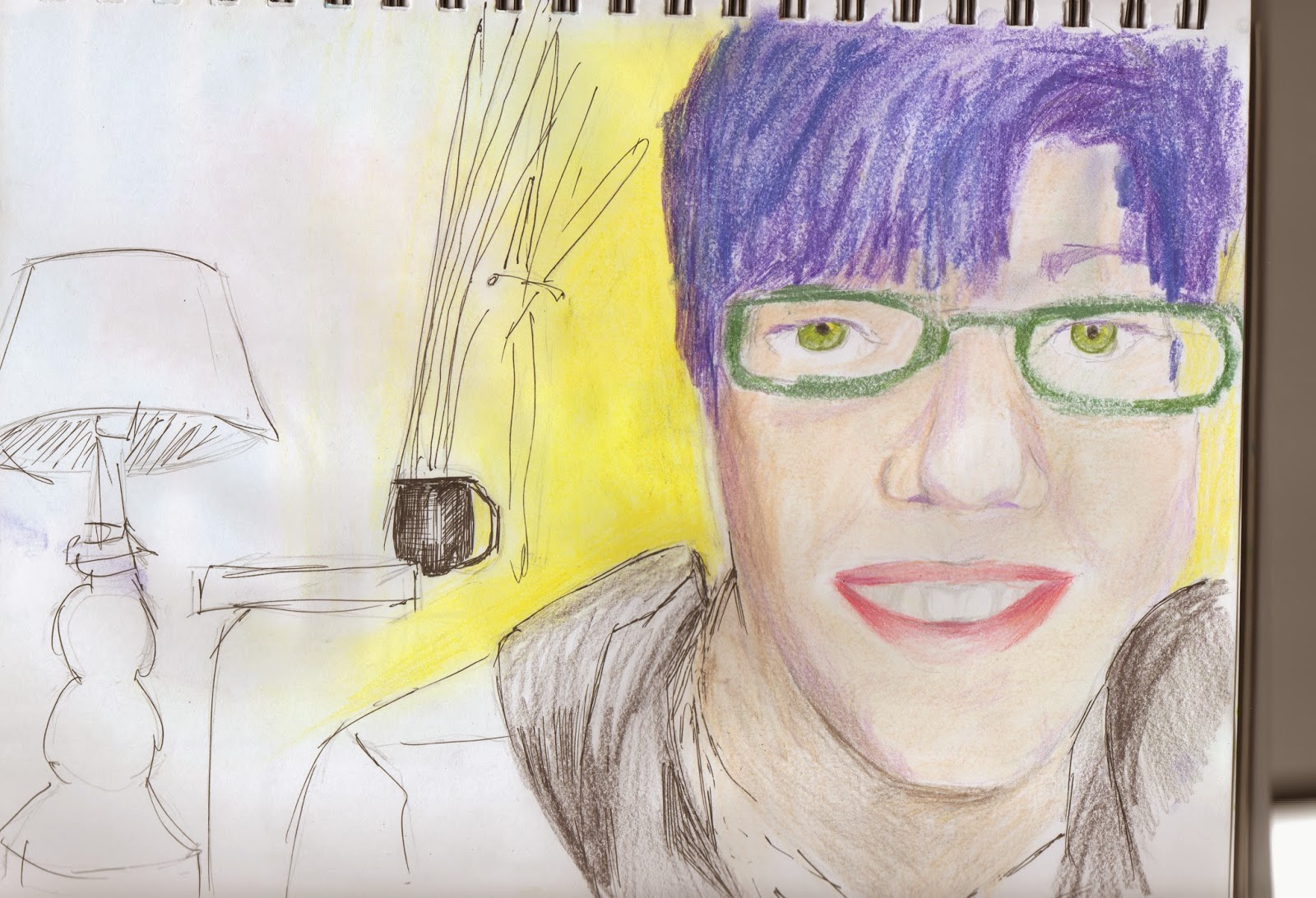

The following day we were to do a portrait inspired by light and color. I totally do not have purple hair.... but how cool would that be? Instead, the bright morning light made think about what my hair could be. I was ready to abandon this drawing a couple of times, but even though its not done, I think it was a fun study in color. Lord knows I haven't opened my box of Prisma color pencils in ages.

Next challenge was an urban scene.
Its cold out.
I picked an internet photo of one of the prominent buildings in my city. Lots changing here with reconstruction, but I think this building will stay.

Next was a monument...
We have a granite ball right next to city hall. Its a little weird to me but I really wanted to paint/draw the cherry blossoms that will be here soon enough, while it was snowing outside. The granite sphere was a gift for the city's 300th anniversary. Granite can be found every where around here and the quarries hired many people. The ball actually made it into Ripley's Believe it or Not. Here I used water soluble Portfolio pastels.


Finally, I worked on a landscape using watercolor crayons. I think this is my favorite of the body of work I pushed out this week. I hope to get back to this beautiful marsh soon.


I have found a bunch of these exercises difficult because it is snowy outside. But at the same time, it has been great to get back in the habit of making something. I think it is important to remember that they are exercises and to not spend too much time with each piece.

Saturday, February 15, 2014

Today, I fell in love...

with Monet.
Again.

La Seine at Argenteuil

I can't stop looking at this painting.
I found myself staring at La Seine at Argenteuil in the "Impressionists on the Water" special exhibit at the Peabody Essex Museum. I don't know how long I was in front of the painting. It wasn't until another patron walked up to my side, that I realized I had been staring (dead center, taking up prime space. terrible gallery etiquette!) I was in a trance, a smile stuck on my face and my heart swelling from the beautiful image before me.

When I was a freshman in high school, I was fortunate enough to see "Monet in the 20th Century" at the Museum of Fine Arts Boston. As a fourteen year old, I didn't realize the significance of the show, (Boston being one of the first American cities to appreciate Monet and continue to do so during his career and after his death) but eventually I regarded the experience as life changing...

Here's the story:
When I started high school, my elective was Band. At that point in my arts "career," I had played piano for a couple of years then took up the flute in fifth grade. By the end of middle school I was playing the equivalent of first chair. I had friends in band and enjoyed the sense of community. The catch was, if you were in concert band, you had to also be in marching band. I spent the summer learning how to march, memorizing the music and the steps I had to take to complete the performance.

Then in October, my Mom and Nana planned to take me into the big city to the Museum of Fine Arts on a Friday night. It would be a girls' night, Nana traveling from Long Island the day before, and we would take the train and everything! But that meant I'd have to miss a football game. And as a marching band student, I'd have to sacrifice an entire letter grade if I missed the performance.

Iris 1914-17

I didn't want to do it. But I did.
Eventually we talked to my guidance counselor. And I switched into Art...

A print of Iris, complete with the date of the show, has hung in every bedroom I've lived in since 1998.

What I loved then about Iris was that Monet was painting abstractly, losing his sight and dealing with, most likely, post traumatic stress after going to war. I sympathized... I was battling the unexpected death of my father. And like Monet, had turned to art, and poetry, as a release.
What I love about it now, as its one of the first things I see when I wake up, is that there is always something new. Browns that I have never noticed, or pinks that only emerge in certain light. I have to remind myself of the title some days. I find the painting enchanting.
And, it holds a wonderful memory. One that has changed the course of my life.
_________________________________________________________________________________

Almost 16 years later, I have again been inspired by Monet. This time as a relatively new painter. I think, no matter how cliche, I've always wanted to paint like an Impressionist. I find myself getting caught up in clean brush strokes and blending though. Perhaps now I will find a way to let it go and get a little more gestural with my painting, more like my drawing. Either way, I now have a beautiful, matted print of La Seine at Argenteuil that I plan to hang next to Iris.

Side note, the Peabody Essex Museum is FREE for teacher's with MTA cards!

Wednesday, February 5, 2014

Artsy Book Club- First 3 Days

After taking a drawing class this past fall and my painting class on Nantucket over the summer, I've been reenergized as far as making my own art. When I read that Cassie Stephens, was starting an Artsy Book Club, I was really excited for the opportunity to continue creating from the comfort of my home and sharing my efforts on the world wide web with fellow Art teachers.

If you haven't read about it so far, theres a bunch of Art teachers reading and drawing along with One Drawing a Day. Below you will find my first... and second attempts of the first three days.


 First I set up a still life. eh. I have just started to draw with pen and this was an okay attempt.


A couple of days later I was inspired to draw our beloved "Blue Chair" to redeem myself.


The next day was a challenge with pen and ink. At the time I didn't have one, so I used a pen I had from my textile design days, meant to be used with guache. I loaded it up with slightly watered down green watercolor.


 This plant is pictured in the Blue Chair drawing above.


Day Three's challenge was to draw someone in proximity.
I bought pen and ink at this point, but the pen's nib was broken and rather erratic. I managed to get a satisfying drawing of my boyfriend's hands. Then, trying to subdue the pressure, I drew my boyfriend's face while he was watching the end of the most recent Super Man movie. This time I  dipped the end of a shish kabob skewer in ink. I was able to control the ink much more easily. Can you tell he is wearing a hoodie and in the blue chair from Day One?
 

I think this drawing captures his Clark Kent (handsome (serious)) alter ego pretty well!
(He's a teacher by day, bassist by afternoons and weekends)

Keep Calm and Paint On

for now at least. 
Found Here

At the end of Term Two I think we were all a little strung out, ready to be done with our awesome Value Drawings.  
Since Term Three started last week, we have been talking about color and painting. 
Its been like night and day in my classroom. Painting appears to have this awesome calming effect on my high school students.

We're not really inventing anything new here. First, we used acrylic primary colors to paint a color wheel, discussing primary, secondary and intermediate colors. 

Yes, this is something that I hope my high school students already know, but some don't. 
Currently in my city, elementary school students have Art every other week for about 45 minutes. This amounts to about 15 hours of Art a year. Middle school students have Art about once a week. At least one of those schools does not have a sink... so some students NEVER paint until high school. 
I know painting has nothing to do with color and color mixing, but I do feel that it is one of the best mediums for explaining the concept. 

After completing the "practice" color wheel, students have been asked to "reinvent" the wheel, using the primary, secondary and intermediate colors. The catch is to also show the relationship between the three main complementary color pairs. 
So far I've seen many designs that use triangles and circles, but other that have incorporated monsters, aliens and skulls. Pictures soon I hope!

In addition, students will need to design a related painting that uses, tints, tones, shades and neutralized color of one, two or three hues. 
These exercises are in preparation of a longer term acrylic painting on canvas board (or possibly oil pastel design) using a color scheme of choice. 

I am pretty excited and hope the calming effect and novelty of painting don't wear off any time soon!

Tuesday, January 28, 2014

Light and Color


We have officially entered the world of color!
This photo is courtesy of one of my seniors in our Art One course. 
I'll explain how she made it in a moment.

Much of this introductory lesson is adapted from Exploring Visual Design.
Through our first activity, I attempted to emphasize the importance of color. With the desks in groups of four, I placed a black and white photocopy of an image at each set of tables and asked the group to discuss what was in the image, what the story might be and what the mood or emotion is that the artist is trying to convey.
After a few minutes of discussion, I asked for them to make predictions: What color would each item be? How might the story change?
Then I gave students the color copy and they compared. I loved hearing the ohhhs and ahhhs. Color made a huge difference?

But where does it come from? What is it?
I enlisted the help of someone a little more qualified:


From the video we learned about light, white light and the reflection and absorption of color. We briefly talked about neutrals as well.
Next, we played around with light and the reflection of light and color. I borrowed some gels from the drama teacher and allowed students to use the camera on their phones plus the filters to see what happens when certain colors are filtered out.


This doesn't seem like much, but the blue is greatly intensified. Plus, extra kudos for composition.


The wizard was part of our drama production last year. Looks menacing with an extra layer of green!


Same subtlety as the blue and interesting composition.


Probably one of my favorites. Great composition.
Seems like everyone had fun, just hope students actually learned something.

Saturday, January 25, 2014

Art One Value Drawings


We have officially made it half way through the school year!
With just one more round of midyear exams, thanks to a snow day, our third term will be underway next week. The majority of term two was spent working with value; developing an image and executing the final product.


So much went into each of these drawings.
For many students, this was a great challenge, as this was the first assignment where they were given a significant amount of time and freedom.


To prepare, I talked about value in terms of the lightness and darkness of a surface. We completed two mini- projects, which I posted about here. We broke it down to five elements of shading, identifying full light, half tones and cast shadows of various objects.


In addition, I introduced the Rule of Thirds to help with composition.
I suppose it is more of a photography technique, but I feel like it really helps to create more dynamic images. At first it was an abstract concept to my high school students, but when I put it in terms they understood... pointed out why Instragram has that funny little "hashtag" and why the pictures always look awesome when you know how to use the grid correctly (its not to put stuff in the middle as many initially thought)... they got it!


I also developed a worksheet in addition to showing the video. It has a place to record a definition, or at least take notes, then five pictures (including one of my own photos) for students to analyze.


We also watched this video during another class and took notes on Six Ways to Create the Illusion of Space. This actually popped up on my blog roll when we started this assignment and it was perfect timing. I again had a small "viewer's guide" to along with the two minute video. I find that giving students something to write down is a good signal to them that its important information. I also made a poster to reiterate the concepts. 


To develop ideas, we spent a couple of classes in our library. I encouraged students to think about broad, overarching topics. I provided a few graphic organizers, including an ABC brainstorming chart that encourages student to list something for every letter of the alphabet about a topic.


Students gathered a few reference photos to work from. Others even used their friends and phones for a photo shoot.


I really enjoy how each image is unique and speaks to the individual. The concept is the same, using value to create form and space, but each voice and style is still there.


For many, it was difficult to come up with a concept on their own. I spent a great deal of time working one on one with students through this process. Reflecting on the assignment, I may narrow down the broad ideas for them in the future. For example keep it to fantasy and fears. I'd also spend a little more time on observational drawing of the basic shapes. Its boring, but I need to find something to really solidify the concept of what value is and how to effectively use it. The majority of my students "got it" but I'd like a way to bring that number up.

Overall, I am absolutely thrilled with the results! I have amazing, dedicated and driven students. This was not an easy assignment by any means. Each student had to think of an idea, develop it, and push themselves to do something they had never done before. In the end, I asked for a written reflection about their work and the process they took to create it. Many commented that it was difficult but were surprised by what they could accomplish and were equally proud of their drawings.

I think we can all agree however that we are ready to enter the world of color!

Wednesday, January 22, 2014

Self Portraits with Technology

I've only been teaching for six years and I have seen a huge increase of technology in the classroom and in the home. When I was in high school, the Internet was still new and if you wanted to use it for a research paper, you had to go to the library. Now, I can wirelessly print a picture from my cellphone and access the internet on my t.v.. When I got an iPhone this summer, I realized just how attached to technology my high school students really can be.

Last spring I taught myself how to use iMovie and created this video about digital literacies for a graduate class.


Now that I am teaching high school full time, I have a little more access to technology (and time) and try to use it as much as possible to engage my students. Last week I had my own "aha!" moment when I stepped back from a lesson and saw that it was actually working. (perhaps thats because the day before I could only get a half step ahead of myself and had an off day.)

My Art 2 students will be designing a mixed media self portrait in the third term. The portrait part will be in pencil and I have a wide range of abilities when it comes to using value. I'd say that the majority of the class initially felt intimidated drawing themselves, even with a printed photo reference. So, I went to the internet, specifically The Virtual Instructor and gathered a bunch of video tutorials.

First we reviewed the proportions of the face.


I asked students to take notes and draw along with the instructor. This particular video was a review, as I had introduced these concepts before the holiday break.

Next we watched the tutorial about drawing eyes. High school students love drawing eyes and I think this is a great example of how planning out and applying value can really bring a drawing to life.


(This isn't the exact video, but one I could upload from youtube)

Now here is where it got fun, for me.
I paused the video occasionally to reiterate vocabulary and techniques and when the video was over, we took out the mirrors and students drew their own eye, with the information they just learned. It was awesome! I think many students were surprised by what they could accomplish. Success!

We followed this pattern over the next few classes for mouths, noses, ears and hair. All of which can be found at The Virtual Instructor. Students now have a bunch of "studies" and notes to fall back on when they are working on their final portraits after midyear exams this week.


This particular student LOVES old, vintage cartoons. He is constantly doodling. I feel like this was a great exercise for him. We talked about finding a balance between his style of drawing and realism. The eye on the top right is a wonderful example.