Showing posts with label oil pastel. Show all posts

Saturday, March 16, 2013

Construct, Observe, Color

I mentioned a little while back that my saving graces this year have been my new work buddies and my Art 2 students. Yesterday was one of the best days this year and it makes me sad, no matter how tough it has been, that I may not be up at the high school again next year. I think there is going to be some major shifting around in our little art department. At the very least I will go back to the position that I had last year, teaching part time middle school art. I know my principal there said he will advocate for me. He reassured me that I shouldn't be worried, but nobody likes change. I will be happy to have the opportunity to keep doing what I love. And for that I am very thankful.


The images above are of a three part lesson/ unit about observation and color. This is one that I feel like I built from my own idea and am proud of the results. Traditionally, I have had eighth graders observe and study still lifes that I have constructed.


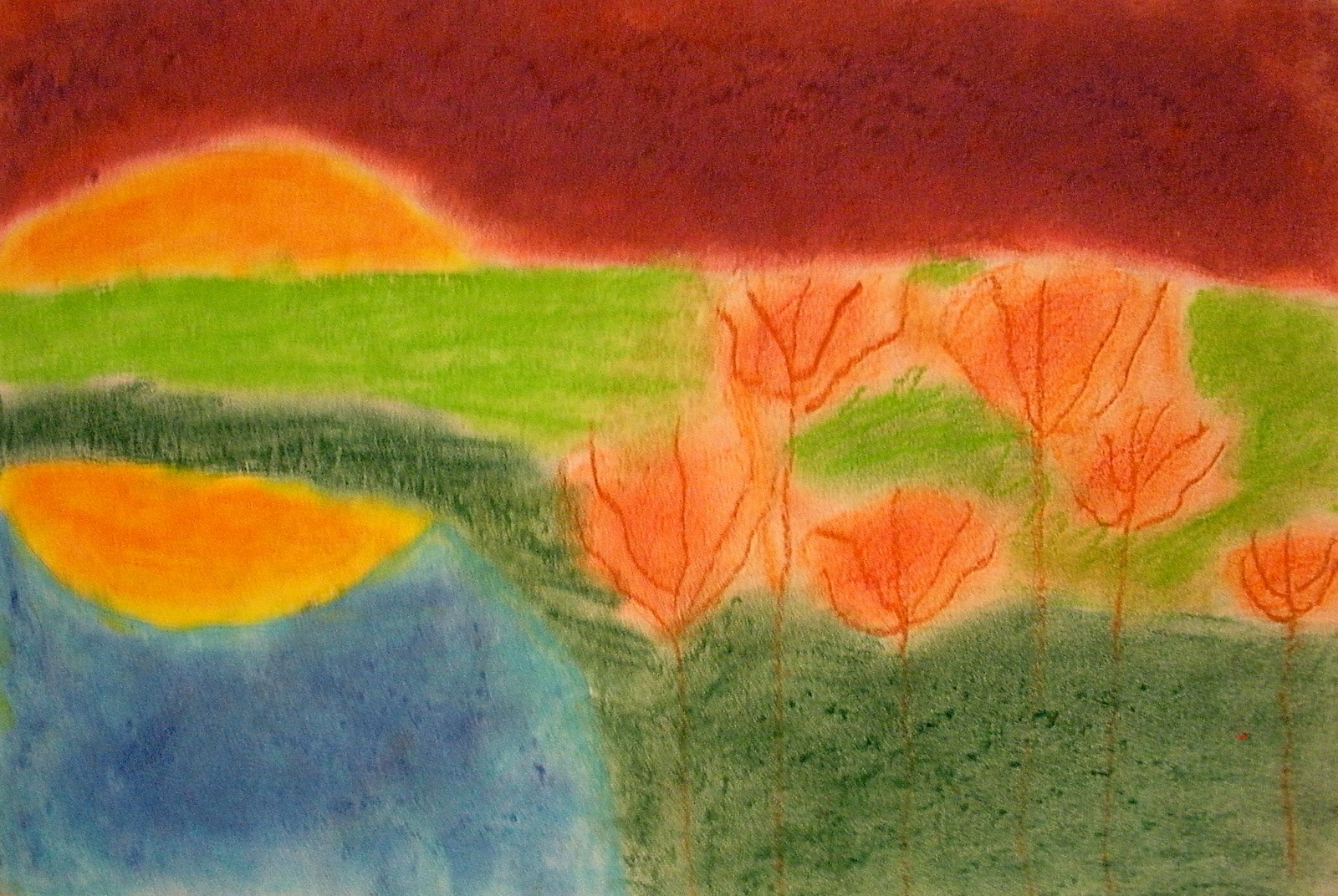
These two images are from the school where I first taught. The students are in tenth grade and I occasionally see a few at the school where I teach now. The student on the end (left) produced the image below of the white still life.


So, I took this idea and tried to step it up a little for my Art 2 students. Still life and value drawing are pretty big components of Art 1, but I didn't want to have them draw my boring old (literally dusty at this point) still lifes. I had the genius idea that with such a small class, only 15 students (!), I could bring in a bunch of recycled materials that I had been collecting and have them construct their own. There were egg cartons, paper towel tubes, broken down cereal boxes, cardboard scraps, bottle caps, newspapers, hot glue, scissors and tape. I demonstrated a few construction techniques and reviewed objective versus non- objective. Then I let students take off!

When the pieces felt balanced and complete, I had students spray paint them white. At first I had gesso, but many of the materials we used were very porous. It was like a sponge soaking up water, but the spray paint worked better to block the "pores" and cover the sculptures. Thankfully we have a vent, so we did not have to go outside.


I don't know why this is sideways, it is correct in Picasa! I get to share a pretty sweet classroom with fabulous prints and spotlights. The now white sculptures were placed under color lights and students completed at least three color studies with dry materials of their choice. If I were to do this again, I would try to find brighter color bulbs. I put them in clip lamps like the one pictured above in the front of the room, but they didn't shine very far. It was more like mood lighting. Plus, I didn't realize how much light came through the sky light, so there was not as much contrast as I had hoped for. 

As the last student finished up their sculpture and began the color studies, I reviewed color more in depth. I attempted to have groups of students become "experts" on different color schemes and then share with the class at large, but this group is not very vocal. I need to improve this part of the lesson, but I think the handout I provided was helpful.

Finally, students selected a color scheme and completed a long term acrylic painting of their sculpture in that theme. 


Sorry for the weird shadows. There were no lights in the display case.
When the painting was complete, students could paint their sculpture however they liked. I would maybe switch these last two steps. Initially I felt that keeping the sculpture white would help students see different values and then they could interpret that into color. I think that worked, but not for every student.

I have such a great group of students! There are a handful not pictured because they're still not entirely done. They are actually more of the objective pieces including a turtle, fish and wolf. What was great about this activity was that every student was successful in their own way, from the gifted student to the student with special needs. There was something for everyone, forcing some out of their comfort zones and causing students to look and think in a new way. I'm really proud of these kids and I can't wait to share some of their more recent work!

Friday, March 1, 2013

Color Scheme Number Design


This sixth grade lesson was inspired by Figure 5 in Gold by Charles Demuth and Numbers in Color by Jasper Johns.

To motivate students, I asked a few to share what their favorite number is and why. We discussed how numbers have meaning to people and cultures. I suggested that artists may be inspired by numbers as well and presented a slide show of work from Robert Indiana, Jasper Johns and Charles Demuth.

Students were then instructed to select one number to be repeated numerous times around the page. We quickly talked about typography as I gave each table a sample of numbers in different type faces. I drew a sketch on the white board to demonstrate variety of size and placement. Finally, students used up to seven lines to divide the page and create new spaces and shapes. By the end of the first class, students traced their lines with white glue. This time, I demonstrated a few techniques using the document camera.

At the beginning of the next class, I gave students a vocabulary activity to complete independently or as a table, explaining that they would be using the words for their designs. Students were asked to match the correct definition to a color scheme, using a glossary (from Art: A Global Pursuit) and photo copy of terms and definitions.


Students were asked to choose from a warm, cool, monochromatic, analogous, triadic or complementary color scheme for their number design, now that they knew a color scheme is a plan for selecting colors. I noticed that pink and lime green is a thing amongst the sixth grade girls. I had to walk a few of them through how that could fit into a color scheme.


There were also many with warm colors/cool backgrounds and vice versa. Students were encouraged to experiment with blending and making new colors within their color scheme. If I were to do this again, I would cut down the size from 12x 18 to 9x12. I'm finding many students do not have the stamina to complete the larger size, especially after missing class for snow days and special events. Overall, I am pleased with the results, most students are proud of their work, and I was able to expose them to new materials, techniques and terminology. (I think my favorite however, is the one at the beginning of the post!)


Saturday, February 2, 2013

Wolf Kahn Inspired Landscapes

There's a little, independent bookstore we like to poke around in whenever we visit Woodstock, VT. I tend to gravitate to the kid's section since I can't resist a good picture book. Right next to the kid's section are spinning racks of beautiful stationary. The bright colors of the Wolf Kahn prints have caught my eye on numerous occasions so I knew I needed to create a lesson and pass on my inspiration to my students. After a visit to the MFA, I purchased (with my student discount!) a calendar of prints and began formulating my ideas.

I think this lesson is suitable for all age levels, but I geared it towards my eighth grade students. One of our "units" of study in this grade is Invented Worlds. The formal elements I attempted to teach here were meant to carry over to the next lesson which is one point perspective. (We've been working on one point perspective cities and rooms now for over a month! I also added a surreal twist and hope to post some soon)


I began this lesson with a Power Point. I think slide presentations can be ineffective, so I try to make them interactive by asking students questions about what they see and calling on students to read the brief informational texts. I've also started developing "viewing guides" to go along with my presentations. Not only does this encourage students to be more accountable for the information being presented, but it also promotes literacy. This is a big buzz word lately in education. I'm currently enrolled in a graduate class (one of my last!) focused solely on "new literacies." While initially nervous about taking a course so focused on reading and writing, I am excited about the possibilities and the new ideas I can bring to my classroom.

I know I am digressing from the lesson, but after two short years in my school system, I really want to validate art as an integral component in the well rounded education of my students. Right now, the arts are supported, but sometimes I feel like its only because the work "looks good." Like, "thank you for beautifying the school" and "how awesome are those art works!" In reality, it needs to be more about the process, thinking creatively, learning skills that can apply in other situations outside the art room and an appreciation.  A LOT needs to happen, like getting a department head, before the system can get there. But I feel like the more I learn, the more I can try, the more my students will get out of art class. Back to Wolf Kahn...


After viewing the power point, students were asked to use the vocabulary to fill in the blanks. I gave students a hand out that looked like this:

Name:
Grade/Section:

Wolf Kahn
LANDSCAPES
 

Extraordinary
Foreground
Unusual
Middle ground
Horizon line
Background

1.     Where water or land meet sky is the  _______________ and at the viewer’s eye level in a work of art.
2.     Parts of a work of art that seem closest to you are called the _______________.
3.     Parts of a work of art that seem to be between objects in the foreground and the background are said to be in the _______ _________.
4.     Wolf Kahn’s artwork became famous because of the ______________ or _______________ colors that he uses.
5.     Using ________________ can also create the illusion of space in a work of art.


Use the above vocabulary to create 2 landscape sketches. You may use color pencil to experiment with unusual or extraordinary color combinations. Attempt to BLEND colors.


The presentation, vocabulary and sketches took about one and a half classes. During the second class, students were told that they had a choice of materials for the final image. They had a choice of oil pastels (I had florescent available), chalk pastels or watercolor with oil pastel to create a resist. There was scrap paper so that they could experiment with the different materials first. The only real requirement for their image was to include foreground, middle ground and background. During each class, I put laminated calendar pages at their tables so they could have a visual as well.

I feel like the landscapes most reminiscent of Kahn's were the ones completed with chalk. The florescent oil pastels I had were terrible if blended with any thing else and not very opaque. The mixed media images came out with more softness and a nice balance but the colors were not as bright. Overall, I think it was a successful lesson. I am confident that when my students go on to high school, that they will know what a horizon line is (I have students at that level now who do not). I was happy to see that the majority of my students did NOT put the horizon line right, smack in the middle and only a handful had the happy little sun in the corner. By choosing their own materials too, they had some more ownership. For some the openness was overwhelming, but I'm pleased with the results and proud of my students.


Monday, January 21, 2013

Egyptian Pharaoh Portraits

Probably four or five years ago, I purchased one of Patty's first PDF packages at Deep Space Sparkle. At the time I was working for a summer camp as the art specialist and this lesson fit in perfectly with our "World" theme that year. Since then, I have completed this lesson at two different middle schools. I love it because from the teacher's point of view, you can really use whatever materials you have and you know your students are going to be successful. From the student's point of view, it may be a challenge to draw a face, but its well worth the "risk" and there is plenty of room for creativity.

This year, students used oil pastels and metallic color pencils on black paper. Students were encouraged to blend oil pastels to make new tints and shades, especially for the skin tone.
Another reason I like this lesson is because both boys and girls tend to like it. Middle school students can get a little touchy if topics aren't approachable for them. Selecting lessons that are welcoming for all students is something to really think about when selecting any lesson really.

It wasn't a requirement, but students were encouraged to integrate their background knowledge in their designs. I have been trying this year to have my seventh grade lessons follow the chronological order of the Ancient Civilizations students are learning about in Social Studies. I have also been using Visual Thinking Strategies whenever possible this year. For this lesson, I projected an image of a mummy mask, straight from the Museum of Fine Arts' (Boston) online collection, and we discussed what we saw using VTS. Allowing students to make connections on their own, with just a little guidance from me, made this lesson a richer experience.


Sunday, April 17, 2011

Sunflowers

I know reproducing "Sunflowers" by van Gogh is a pretty standard lesson. I have only done it twice in the last four years though, and I could not resist reading another Laurence Anholt book to introduce my second graders to the artist.

  • first we read "Camille and the Sunflowers" then looked at van Gogh's "Sunflowers." we talked about what we saw in general, then narrowed it down to the elements of art. for the first class, we specifically paid attention to the shapes and lines.  one class thought some of the flowers looked like fuzzy donuts!
  • we drew with black crayon on 12x18 manila paper. something that I think helped with the composition was asking the kids to draw all the flowers above the vase first, even having some go off the paper, then adding the stems. for some reason, I think because of a lesson we did back in the fall, my second graders love using overlapping. so when it came time to add the stems, they knew some would overlap before making their way into the vase.
  • the second class we began by revisiting the painting and this time looking for as many colors as we could. the kids realized that the flowers were not painted with only yellow!
  • with oil pastels, we began to add color. I went from table to table, demonstrating how to layer the oil pastels, and how to add all the little lines and different colors we saw, especially in the fuzzy donut :)

some kids really got into this lesson. so much so that they needed an extra class. about every six weeks I have a "choice" day for second grade. its an earned treat for good behavior. so what I have done the last few choice days is have the students who need more time on an assignment finish first and then pick a choice...

choices are things like "free" draw, using my how to draw books, sometimes a little "special project" with me (watercolor, extra scratch art paper etc.) art games like cloodle or "the word game" (I have a deck of cards with adjectives, nouns, verbs and places. the kids pick one of each to make a silly sentence and have to illustrate it) pattern blocks, crystal climbers and if I am feeling particularly nice, legos... again, it has to be earned and we have a chart to keep track of our good listening and behaving day. having never taught as young as second grade, its been a learning experience, but rewarding. I would like to take the idea of the earned choice and use it next year with other grades.

back to Sunflowers.... it totally worked out that we did this the week of van Gogh's birthday. our principal talks to us about "this day in history" during the morning announcements and I could almost hear the second grade cheer from down the hall when she mentioned it was van Gogh's birth anniversary over the loud speaker. a simple, yet awesome lesson. I can't wait to see what these little ones will be able to accomplish when they are older.


p.s. LOVE my new camera! can't stand loading and formatting pictures in blogger though. so frustrating!

Friday, March 11, 2011

visual music

with the hopes of a spring art show, I have been going back to some old activities... haha I only started teaching at a school in 2008. haha, old.

when I started though, I didn't have much in the way of tested, structured, thoughtful lessons, so I bought this book, Making Amazing Art: 40 Activities Using the 7 Elements of Art Design with the focus that year on getting down to basics (as the six classes I had that year, NEVER had art with a "real teacher.")

one of the most successful lessons I did that year was "Visual Music."
the element of art we talked about was line. how not only does it help us make a contour line drawing, but also shows emotion, movement, and even sound. that year, as I did this year, I asked students, if they had permission, to bring in their instruments. it worked out to be a band day this year! I also brought in an electric guitar and finally grabbed the attention of some of those 6th grade boys! we spent a day talking about line and sound and music, and sketching out our ideas, observing what we brought in. I even played a compilation of "abstract" music so we could "hear" many different lines.
the next class, students were allowed to choose whether their final would be watercolor painting or oil pastel drawing. we just spent about a month on a tempera painting and I know some kids needed a break from paint. those who watercolored drew with sharpie first. those who oil pasteled, outlined with black crayon first. these are the results:


after this lesson, I decided that I really like the look of the liquid watercolor and sharpie line. its nice and graphic. I hope to recreate that feel with the "For Baby" illustrations with 4th and 5th grade. I also have to apologize for the quality of pictures... I don't know what I took them by the window. it washed out some of the color. I will have to take a picture of the display I put up yesterday outside the music room.