Friday, April 29, 2011

For Baby

one thing I love about blogging is checking my "stats" at least once a week. I suppose its a sign of the times, maybe even my generation, the instant gratification and the knowledge that someone out there on the world wide web actually cares, even for a few seconds, about my little life. that being said, if you have read my blog more than once, follow me!
since January, my blog had been viewed over 500 times! but I only have 8 followers... click it on the right (Mom)

__________________________________________________________________

the day came when I had a chance to show off my fourth and fifth grade work during the spring concert. I was actually nervous! mostly because I was not comfortable setting up the projector with my laptop by myself in the church where the concert was held. but, I did it. I think the best compliment I received was that the combination of the images and the kids singing made the fourth grade teacher cry!

So, what we did:
  • First we listened to John Denver's "For Baby" (aka "For Bobbie").
    Then we listened to the song and looked at the book illustrated by Janeen Mason.
  • Finally, we discussed what an illustrator does, talked about what the theme could be and brainstormed what our illustrations could include.
  • Meanwhile, students practiced singing the song in music class.

I am a teacher who enjoys the process of art making. So as much as I know it annoyed some kids, I required students to come up with three ideas. We quickly sketched them in rectangles on an 81/2 x 11. And by quick, I mean that it took some of us a class and a half. We looked at old calendar pages filled with landscapes and animals for inspiration. Prior to starting this lesson, I did a quick lesson about drawing people and faces too. I attempted to conference with each student about which idea they would like to use for the final before starting.

  • The background was lightly sketched on white 12x18, traced with black sharpie, and painted with liquid watercolor.
  • Students were then given a 9x12 white paper and were instructed to draw their people or animals as large as possible. I would give out more paper as needed.
  • The people or animals were colored in with color pencils and students could choose if they would like to trace their lines with sharpie or not.
  • Finally, students cut and pasted their people or animals into the background.
  • I also had a very simple rubric for students to read and grade themselves... I wanted to know their thoughts on their craftsmanship, thought process and in class behavior. 
Maybe I can put the show on you tube, but in the mean time, here is a selection of the almost 70 pieces in yesterdays show. 


Tuesday, April 26, 2011

April Vacation cont'd

I powered through Monday and today. being tired hit me like a ton of bricks at 3pm this afternoon! vacation was great, but I almost wish there had been on more day in order to recover from Easter.

vacation started with Record Store Day and an evening going in town to see my boyfriend's band. Our local Newbury Comics had a few good pick ups, but we really hit the jackpot at a little independent store in Brattleboro, VT. we drove over from Woodstock on one of our days up north. even though it was rainy, the small town center was recovering from a fire in one of the few buildings, and the art museum was closed, we enjoyed our short visit.

I also had a chance to play with my new camera!


the Woodstock condo

Long Trail Brewery!
Harpoon Brewery... they have an indoor fire pit!


I still have a lot to learn about all the settings and what exactly my camera can do. For now, I am very happy with my birthday purchase!

Friday, April 22, 2011

Happy Earth Day and April Vacation

this is my latest work of art... I actually made my own art this week! love vacation. I started this piece in August, and I am not sure I am totally sold on it yet, but it may feel more complete once I put it in a black, LP frame I have kicking around.
I went to an MA NAEA conference at UMASS Dartmouth a year ago November and one of the workshops I went to used this collage process that I have fallen in love with. I have always worked by adding and then subtracting, whether textiles or drawing, so this process really works for me. My AP exam concentration was using collage too, so this combines all my favorite art making techniques... anyway, I glue magazine and catalog pages to whatever I have laying around, in this case some leftover mat board I have or may not have taken from the scrap bin when I worked at Michaels... I used matte medium as the adhesive. before a piece of paper totally dries, I pull it off the mat board, and see what it leaves behind. sometimes I will do that with a piece of text too. From there, I keep working, adding and subtracting as I see fit. In this case, I used some almost transparent gold acrylic too.
This is one of the first, if not the first, piece I did using this process. I left a lot more of the original collage, and added red and blue paint. You can see in the top right corner some of the text too. I also incorporated some paste paper I've been carrying around since high school! seriously, I have a tupperware of papers I've collected over the years... should have known I'd be an art teacher!

Sunday, April 17, 2011

Sunflowers

I know reproducing "Sunflowers" by van Gogh is a pretty standard lesson. I have only done it twice in the last four years though, and I could not resist reading another Laurence Anholt book to introduce my second graders to the artist.

  • first we read "Camille and the Sunflowers" then looked at van Gogh's "Sunflowers." we talked about what we saw in general, then narrowed it down to the elements of art. for the first class, we specifically paid attention to the shapes and lines.  one class thought some of the flowers looked like fuzzy donuts!
  • we drew with black crayon on 12x18 manila paper. something that I think helped with the composition was asking the kids to draw all the flowers above the vase first, even having some go off the paper, then adding the stems. for some reason, I think because of a lesson we did back in the fall, my second graders love using overlapping. so when it came time to add the stems, they knew some would overlap before making their way into the vase.
  • the second class we began by revisiting the painting and this time looking for as many colors as we could. the kids realized that the flowers were not painted with only yellow!
  • with oil pastels, we began to add color. I went from table to table, demonstrating how to layer the oil pastels, and how to add all the little lines and different colors we saw, especially in the fuzzy donut :)

some kids really got into this lesson. so much so that they needed an extra class. about every six weeks I have a "choice" day for second grade. its an earned treat for good behavior. so what I have done the last few choice days is have the students who need more time on an assignment finish first and then pick a choice...
choices are things like "free" draw, using my how to draw books, sometimes a little "special project" with me (watercolor, extra scratch art paper etc.) art games like cloodle or "the word game" (I have a deck of cards with adjectives, nouns, verbs and places. the kids pick one of each to make a silly sentence and have to illustrate it) pattern blocks, crystal climbers and if I am feeling particularly nice, legos... again, it has to be earned and we have a chart to keep track of our good listening and behaving day. having never taught as young as second grade, its been a learning experience, but rewarding. I would like to take the idea of the earned choice and use it next year with other grades.

back to Sunflowers.... it totally worked out that we did this the week of van Gogh's birthday. our principal talks to us about "this day in history" during the morning announcements and I could almost hear the second grade cheer from down the hall when she mentioned it was van Gogh's birth anniversary over the loud speaker. a simple, yet awesome lesson. I can't wait to see what these little ones will be able to accomplish when they are older.


p.s. LOVE my new camera! can't stand loading and formatting pictures in blogger though. so frustrating!

Wednesday, April 13, 2011

little bunny fu fu

is it the week before vacation or what?
it feels like we all have one foot out the door ready to bolt. and then, when we get back, its only a few short weeks and the summer will be here!

with everything going on, my poor 8th graders will have very little in their portfolio to choose from when it comes time to put up the art show. we do have until the beginning of june, but thats really not a lot of time.
currently we are working on still life value drawings. we are focusing on composition, drawing from observation, creating a range of value and the illusion of space. I brought in an almost 5 foot tall charcoal drawing of an interior stairwell that I did in college and asked questions about space and value. I really hope we can finish before the art show... I'd love to work on a self portrait and wire sculpture before they "graduate" June 10th!

__________________________________________________________________

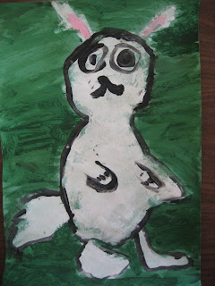
last week, after finishing up another artist study, this time of van Gogh, grade 2 took some time out for a holiday themed activity. I really need to get better at coming up with original ideas. I really do! we painted bunnies like this lesson I found at Deep Space Sparkle.


this one oddly looks like the artist
here is a dilemma to ponder:
first we drew with chalk on color paper. next, I placed a tray with sponges of white paint. as students were finishing sponge painting, I placed another tray with a multi cup holder of pink, black, and green paint. as I placed this at each table, I gave very specific instructions to the small group of three to five students. (first add pink details with the pink paint brush. second, trace your chalk lines with the black paint brush. third, add grass with the green paint brush) out of 36 students, I had 2 like these:


both students sat at the same table.
"copying" usually happens at the same table. I don't encourage it, but I hardly ever say anything. maybe thats wrong, I don't know. if students mention it to me, I remind them of the trees we look at at the beginning of the year... we look at pictures of trees done by different artists throughout history and talk about how we all have our own style even if we have the same subject or idea. of course I encourage thinking for oneself but sometimes theres something to learn from other people.

in this particular case though, I was bummed. the student with the purple background had made a mistake with the white paint. typically, that would throw him off for the rest of class. his painting would become a giant mess, or he would sit, do nothing and be grumpy, or both. but this time, this time he creatively solved his problem! he used what he had and fixed it! our plan was to add white oil pastel when the paint dried to add eyes and other features.
the student with the green background had followed directions very well, up until he saw the other student's work and decided to use the black paint for something other then what was directed. I am sure there are black bunnies in the world. and I can't blame him for wanting to be "creative." but I just didn't know what to say or do... I asked how his bunny became black when it was white before. *shrug* I also asked if it was because he saw someone else do it. he said no. I asked if he had followed directions. umm, not really. I didn't know what to say or do from there. I said okay and we continued with clean up.

I feel like I still have a lot to learn!
Maybe sometime during vacation I will post about how we made Easter lilies out of our hands and how I am awful at giving directions...

Tuesday, April 5, 2011

pop art food poster

the paintings that my 7th graders worked on took most of last term to complete. I knew they would need a break, in a sense. I also know that I want to work up to observational drawing before I run out of time. so, introducing pop artist Roy Lichtenstein and the Pop Art movement, seemed like a good fit.
 we viewed a power point of pop art and Lichtenstein's work and reviewed contour line drawings. we then brainstormed different foods, narrowing down the usual subject of everyday objects, and started sketching. 
 once a food or group of food was decided, students drew the outline with sharpie and filled in the object with the marker version of Ben- day dots.  the last instruction was to use a solid marker line design to fill the background.
as part of the assessment, I asked students to describe how he or she used the elements of art. I have them posted on a word wall in my classroom. I don't know if it was my lack of ability to teach, or the kids' laziness, or not being able to see what they did, but it was like pulling teeth to get them to write down that they used color to fill the object or line to fill the background... one of my goals for next year, and for something to focus on in grad school (if I get in) is reflection. I want students to understand and remember their process and reflect on the decisions they made and how they arrived at the final outcome.

overall, whether they understood they used line or color or not, the pop art food posters came out pretty awesome!

duckfat!

it has been a busy few weeks! thankfully, April vacation is just around the corner, which means summer will be here before we know it.... and I will be panicking as I am the Summer Program Director for the first ever summer camp at my school. :)

as of Friday, I have officially applied to grad school. now I just need to make sure I can afford it and get in!

the last couple of weekends have been pretty exciting too. two Saturdays ago, a bunch of friends who normally wouldn't be able to stay up late enough to see my boyfriend's band, got to catch an evening performance at the local record store.
I really enjoy going to see them play at the venues in town, but this was a nice change of pace and great to see new people get to see them for the first time.

This past weekend, we piled into the car with an other couple and road tripped it up to Portland, Maine for the day. We started with a snack at a restaurant called Duckfat. Everything made there uses duck fat and we had heard, via the Food Network, that the fries were very good. So, we ventured!
we ordered a large fry with a garlic mayo kind of dipping sauce (I don't know how to spell the fancy name) and truffle oil ketchup. we also had the above order of poutine that came covered in cheese curd and duck fat gravy! although I know some were hesitant, it was seriously good! I can't even describe how great the gravy was.
from Duckfat we went to SPACE.
the SPACE Gallery that is. I participated, for the first time, in Art House Co-op's Sketchbook Project. you can find more information here. Essentially, I filled a sketchbook with my images/ thoughts on the theme, "... you'd be home by now," and returned it. About 9,999 other artists did the same, with varying themes, and now the sketchbooks are  on tour! I am super excited about it because my friend in Atlanta can go check my book out next weekend, and during the summer, my mom who lives in Florida, can do the same!
its great that I was able to do some artwork for myself. so often I am experimenting with the materials I have at school, to make sure that the kids will be able to use them to complete their activity, that I don't practice making my own work. however, one of the coolest parts of the sketchbook project is being able to see other artist's works. (on the down side, there were so many books that mine has only been checked out by people I know) I was able to checkout a former classmate's, from high school, sketchbook. her theme was "its raining cats and dogs."


I was also able to track down Phyl from There's a Dragon in my Art Room! As a fellow blogging art teacher, I found this super cool. My friends and I agreed that this was our favorite book of the over two dozen we must have checked out.


you can tell Phyl had a ton of fun with her theme, "science experiment gone wrong." if I participate again, I think I want to pick a theme that is not so near and dear, and I can loosen up a bit!

after a few hours at the gallery, and hit or miss with the sketchbooks, we opted to wander the streets of portland. really, we just went to record stores, but cool nonetheless. knowing how much I love living near our city, I'm not sure I would have lasted had I gone to Maine College of Art, but it was a fun city to visit. I enjoyed the old architecture and the down town arts center. it somewhat reminded me of Brattleboro, VT.

hopefully the weather will be warm by April vacation, and we can take the bikes out of the basement. for now, there are a few concerts on the horizon, and my own school's early June art show to plan. I look forward to my friend's and family's reaction to the Sketchbook Project experience!

Friday, April 1, 2011

emphasis and distortion self portrait


I am so pleased with these portraits!
During my cyberspace travels, I have seen these portraits on other art education websites. I taught this lesson after a quick activity using figures in the style of Keith Haring, to display emotion and movement.


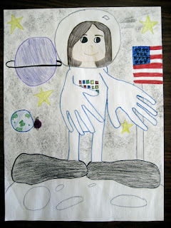
  • The first class, I started with a discussion. I used what I found in a later chapter of this book for inspiration. I asked what students felt the word emphasis means, then asked what was being emphasized in a series of same size circles, five rows by five columns, drawn on my white board. After changing the shape, value, color and size, and talking about some hypothetical s,(textures and form) we learned all the different ways artists can create emphasis; using many of the elements and principles of art. Students were then shown some outlines and past students examples.  How was emphasis created? they were asked. They quickly realized that the hands and feet were HUGE and therefore probably traced. We then brain stormed what we could be doing in our portraits with our huge hands and feet and began to plan our compositions.
  • The sketches resembled little Keith Haring people with big mittens and boots on. We talked about which way our thumbs and toes would point in different poses.
  • With little guidance, students decided what they were doing and picked up a piece of 18x 24 construction paper, from me. Each time I said something to the effect of, This is the only paper you will get, remember which way your toes and thumbs go!
  • Students then traced their hands and took off their shoes to trace their feet. Help from others was ok, but not encouraged. I showed them how to flip their wrist to make a left hand a right when traced ;)
  • During the intro, we talked about distortion, and after their hands and feet were traced, students had to envision looking into a fun house mirror and somehow fit their body in between their hands and feet.
  • Finally, students were asked to create contrast by adding realistic details, like fingernails and knuckles, to hands and feet.