
I think this lesson is suitable for all age levels, but I geared it towards my eighth grade students. One of our "units" of study in this grade is Invented Worlds. The formal elements I attempted to teach here were meant to carry over to the next lesson which is one point perspective. (We've been working on one point perspective cities and rooms now for over a month! I also added a surreal twist and hope to post some soon)

I began this lesson with a Power Point. I think slide presentations can be ineffective, so I try to make them interactive by asking students questions about what they see and calling on students to read the brief informational texts. I've also started developing "viewing guides" to go along with my presentations. Not only does this encourage students to be more accountable for the information being presented, but it also promotes literacy. This is a big buzz word lately in education. I'm currently enrolled in a graduate class (one of my last!) focused solely on "new literacies." While initially nervous about taking a course so focused on reading and writing, I am excited about the possibilities and the new ideas I can bring to my classroom.
I know I am digressing from the lesson, but after two short years in my school system, I really want to validate art as an integral component in the well rounded education of my students. Right now, the arts are supported, but sometimes I feel like its only because the work "looks good." Like, "thank you for beautifying the school" and "how awesome are those art works!" In reality, it needs to be more about the process, thinking creatively, learning skills that can apply in other situations outside the art room and an appreciation. A LOT needs to happen, like getting a department head, before the system can get there. But I feel like the more I learn, the more I can try, the more my students will get out of art class. Back to Wolf Kahn...

After viewing the power point, students were asked to use the vocabulary to fill in the blanks. I gave students a hand out that looked like this:
Name:
Grade/Section:
Wolf Kahn
LANDSCAPES
|
Extraordinary
|
Foreground
|
Unusual
|
|
Middle ground
|
Horizon line
|
Background
|
1.
Where water or land meet sky is the _______________ and at the viewer’s eye level
in a work of art.
2.
Parts of a work of art that seem closest to you
are called the _______________.
3. Parts of
a work of art that seem to be between objects in the foreground and the
background are said to be in the _______ _________.
4.
Wolf Kahn’s artwork became famous because of the
______________ or _______________ colors that he uses.
5.
Using ________________ can also create the
illusion of space in a work of art.
Use the above vocabulary to create 2 landscape sketches. You
may use color pencil to experiment with unusual or extraordinary color combinations.
Attempt to BLEND colors.
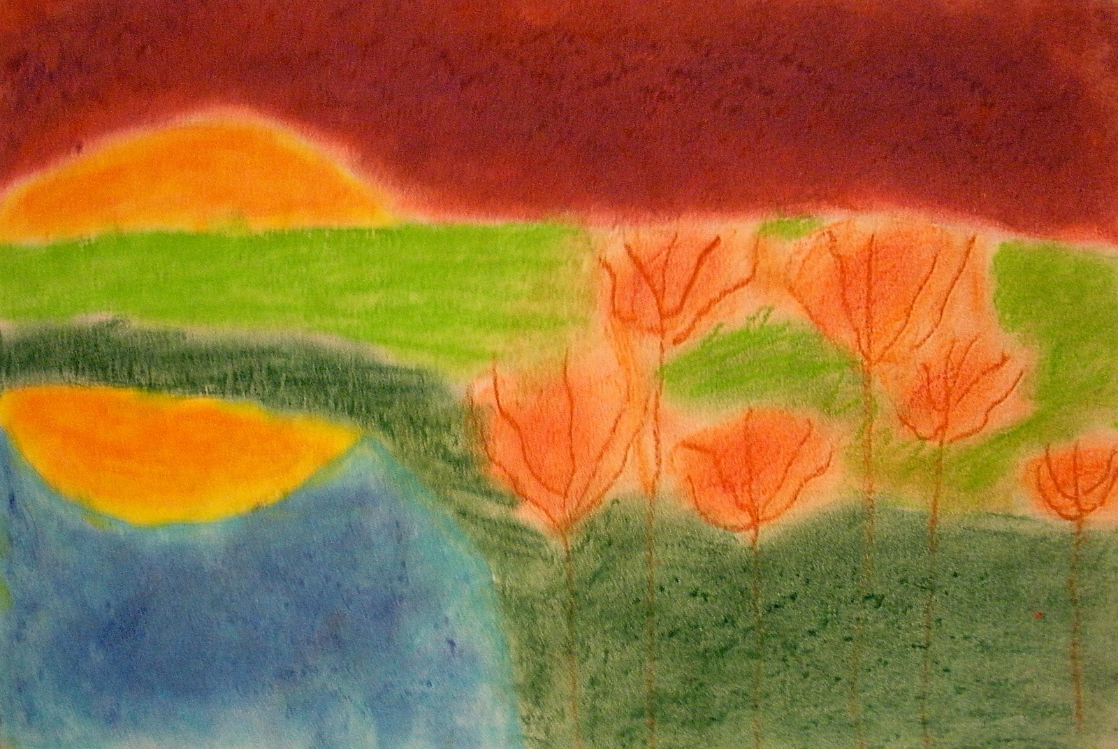
I feel like the landscapes most reminiscent of Kahn's were the ones completed with chalk. The florescent oil pastels I had were terrible if blended with any thing else and not very opaque. The mixed media images came out with more softness and a nice balance but the colors were not as bright. Overall, I think it was a successful lesson. I am confident that when my students go on to high school, that they will know what a horizon line is (I have students at that level now who do not). I was happy to see that the majority of my students did NOT put the horizon line right, smack in the middle and only a handful had the happy little sun in the corner. By choosing their own materials too, they had some more ownership. For some the openness was overwhelming, but I'm pleased with the results and proud of my students.


nice lesson!
ReplyDeleteThank you!
Delete