Showing posts with label color. Show all posts

Saturday, March 16, 2013

Construct, Observe, Color

I mentioned a little while back that my saving graces this year have been my new work buddies and my Art 2 students. Yesterday was one of the best days this year and it makes me sad, no matter how tough it has been, that I may not be up at the high school again next year. I think there is going to be some major shifting around in our little art department. At the very least I will go back to the position that I had last year, teaching part time middle school art. I know my principal there said he will advocate for me. He reassured me that I shouldn't be worried, but nobody likes change. I will be happy to have the opportunity to keep doing what I love. And for that I am very thankful.


The images above are of a three part lesson/ unit about observation and color. This is one that I feel like I built from my own idea and am proud of the results. Traditionally, I have had eighth graders observe and study still lifes that I have constructed.


These two images are from the school where I first taught. The students are in tenth grade and I occasionally see a few at the school where I teach now. The student on the end (left) produced the image below of the white still life.


So, I took this idea and tried to step it up a little for my Art 2 students. Still life and value drawing are pretty big components of Art 1, but I didn't want to have them draw my boring old (literally dusty at this point) still lifes. I had the genius idea that with such a small class, only 15 students (!), I could bring in a bunch of recycled materials that I had been collecting and have them construct their own. There were egg cartons, paper towel tubes, broken down cereal boxes, cardboard scraps, bottle caps, newspapers, hot glue, scissors and tape. I demonstrated a few construction techniques and reviewed objective versus non- objective. Then I let students take off!

When the pieces felt balanced and complete, I had students spray paint them white. At first I had gesso, but many of the materials we used were very porous. It was like a sponge soaking up water, but the spray paint worked better to block the "pores" and cover the sculptures. Thankfully we have a vent, so we did not have to go outside.


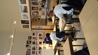
I don't know why this is sideways, it is correct in Picasa! I get to share a pretty sweet classroom with fabulous prints and spotlights. The now white sculptures were placed under color lights and students completed at least three color studies with dry materials of their choice. If I were to do this again, I would try to find brighter color bulbs. I put them in clip lamps like the one pictured above in the front of the room, but they didn't shine very far. It was more like mood lighting. Plus, I didn't realize how much light came through the sky light, so there was not as much contrast as I had hoped for. 

As the last student finished up their sculpture and began the color studies, I reviewed color more in depth. I attempted to have groups of students become "experts" on different color schemes and then share with the class at large, but this group is not very vocal. I need to improve this part of the lesson, but I think the handout I provided was helpful.

Finally, students selected a color scheme and completed a long term acrylic painting of their sculpture in that theme. 


Sorry for the weird shadows. There were no lights in the display case.
When the painting was complete, students could paint their sculpture however they liked. I would maybe switch these last two steps. Initially I felt that keeping the sculpture white would help students see different values and then they could interpret that into color. I think that worked, but not for every student.

I have such a great group of students! There are a handful not pictured because they're still not entirely done. They are actually more of the objective pieces including a turtle, fish and wolf. What was great about this activity was that every student was successful in their own way, from the gifted student to the student with special needs. There was something for everyone, forcing some out of their comfort zones and causing students to look and think in a new way. I'm really proud of these kids and I can't wait to share some of their more recent work!

Friday, March 1, 2013

Color Scheme Number Design


This sixth grade lesson was inspired by Figure 5 in Gold by Charles Demuth and Numbers in Color by Jasper Johns.

To motivate students, I asked a few to share what their favorite number is and why. We discussed how numbers have meaning to people and cultures. I suggested that artists may be inspired by numbers as well and presented a slide show of work from Robert Indiana, Jasper Johns and Charles Demuth.

Students were then instructed to select one number to be repeated numerous times around the page. We quickly talked about typography as I gave each table a sample of numbers in different type faces. I drew a sketch on the white board to demonstrate variety of size and placement. Finally, students used up to seven lines to divide the page and create new spaces and shapes. By the end of the first class, students traced their lines with white glue. This time, I demonstrated a few techniques using the document camera.

At the beginning of the next class, I gave students a vocabulary activity to complete independently or as a table, explaining that they would be using the words for their designs. Students were asked to match the correct definition to a color scheme, using a glossary (from Art: A Global Pursuit) and photo copy of terms and definitions.


Students were asked to choose from a warm, cool, monochromatic, analogous, triadic or complementary color scheme for their number design, now that they knew a color scheme is a plan for selecting colors. I noticed that pink and lime green is a thing amongst the sixth grade girls. I had to walk a few of them through how that could fit into a color scheme.


There were also many with warm colors/cool backgrounds and vice versa. Students were encouraged to experiment with blending and making new colors within their color scheme. If I were to do this again, I would cut down the size from 12x 18 to 9x12. I'm finding many students do not have the stamina to complete the larger size, especially after missing class for snow days and special events. Overall, I am pleased with the results, most students are proud of their work, and I was able to expose them to new materials, techniques and terminology. (I think my favorite however, is the one at the beginning of the post!)


Saturday, February 2, 2013

Wolf Kahn Inspired Landscapes

There's a little, independent bookstore we like to poke around in whenever we visit Woodstock, VT. I tend to gravitate to the kid's section since I can't resist a good picture book. Right next to the kid's section are spinning racks of beautiful stationary. The bright colors of the Wolf Kahn prints have caught my eye on numerous occasions so I knew I needed to create a lesson and pass on my inspiration to my students. After a visit to the MFA, I purchased (with my student discount!) a calendar of prints and began formulating my ideas.

I think this lesson is suitable for all age levels, but I geared it towards my eighth grade students. One of our "units" of study in this grade is Invented Worlds. The formal elements I attempted to teach here were meant to carry over to the next lesson which is one point perspective. (We've been working on one point perspective cities and rooms now for over a month! I also added a surreal twist and hope to post some soon)


I began this lesson with a Power Point. I think slide presentations can be ineffective, so I try to make them interactive by asking students questions about what they see and calling on students to read the brief informational texts. I've also started developing "viewing guides" to go along with my presentations. Not only does this encourage students to be more accountable for the information being presented, but it also promotes literacy. This is a big buzz word lately in education. I'm currently enrolled in a graduate class (one of my last!) focused solely on "new literacies." While initially nervous about taking a course so focused on reading and writing, I am excited about the possibilities and the new ideas I can bring to my classroom.

I know I am digressing from the lesson, but after two short years in my school system, I really want to validate art as an integral component in the well rounded education of my students. Right now, the arts are supported, but sometimes I feel like its only because the work "looks good." Like, "thank you for beautifying the school" and "how awesome are those art works!" In reality, it needs to be more about the process, thinking creatively, learning skills that can apply in other situations outside the art room and an appreciation.  A LOT needs to happen, like getting a department head, before the system can get there. But I feel like the more I learn, the more I can try, the more my students will get out of art class. Back to Wolf Kahn...


After viewing the power point, students were asked to use the vocabulary to fill in the blanks. I gave students a hand out that looked like this:

Name:
Grade/Section:

Wolf Kahn
LANDSCAPES
 

Extraordinary
Foreground
Unusual
Middle ground
Horizon line
Background

1.     Where water or land meet sky is the  _______________ and at the viewer’s eye level in a work of art.
2.     Parts of a work of art that seem closest to you are called the _______________.
3.     Parts of a work of art that seem to be between objects in the foreground and the background are said to be in the _______ _________.
4.     Wolf Kahn’s artwork became famous because of the ______________ or _______________ colors that he uses.
5.     Using ________________ can also create the illusion of space in a work of art.


Use the above vocabulary to create 2 landscape sketches. You may use color pencil to experiment with unusual or extraordinary color combinations. Attempt to BLEND colors.


The presentation, vocabulary and sketches took about one and a half classes. During the second class, students were told that they had a choice of materials for the final image. They had a choice of oil pastels (I had florescent available), chalk pastels or watercolor with oil pastel to create a resist. There was scrap paper so that they could experiment with the different materials first. The only real requirement for their image was to include foreground, middle ground and background. During each class, I put laminated calendar pages at their tables so they could have a visual as well.

I feel like the landscapes most reminiscent of Kahn's were the ones completed with chalk. The florescent oil pastels I had were terrible if blended with any thing else and not very opaque. The mixed media images came out with more softness and a nice balance but the colors were not as bright. Overall, I think it was a successful lesson. I am confident that when my students go on to high school, that they will know what a horizon line is (I have students at that level now who do not). I was happy to see that the majority of my students did NOT put the horizon line right, smack in the middle and only a handful had the happy little sun in the corner. By choosing their own materials too, they had some more ownership. For some the openness was overwhelming, but I'm pleased with the results and proud of my students.


Thursday, August 16, 2012

Scarecrows

When fall really starts to settle in, I realize how much I miss teaching elementary school. I don't think I ever even imagined myself teaching the little ones, let alone enjoying it! But there is something about experiencing their pure joy and uncensored imagination in the art room that is so rewarding. I hope to inspire my middle school kids to continue to enjoy art and use their imaginations. It can be a really turbulent time as a teenager, but art can be a great outlet.


Anyhow this fall lesson, again unearthed from my file transfer, is inspired by Not so scarey Scarecrows from Deep Space Sparkle. I did this my third year teaching, but had found Patty's website about a year before.

---side-note---
I am so thankful for the art teacher community created in the blogosphere! I did my student teaching at the high school level and there were five teachers in the building! It was also in a school that had been built within the last five years, had an amazing department head and equally awesome budget. Going from that to the only art teacher at a parochial school with not budget (that I knew of) two years later, was an adjustment to say the least! Finding people like Patty, Phyl and Mr. E. made me feel like I wasn't alone and encouraged me to provide the best art education I could. (And with the encouragement of Ms. Wilkinson (my college roommate), now at The Tale of a Traveling Teacher, I started my own blog during my third year)
------

This Scarecrow lesson was the first time I felt like I had taken an idea that I found online and really made it my own. And even more rewarding was how much fun these fourth graders had, class after class completing their assignment.


But now, two years later, I can't remember. What did we start with!?
I think we did a guided drawing the first week.
Yup, that's what we did.
We drew the face of the scarecrow, the arms/ shirt and legs however they would fit on the page. I drew different ideas on the board and had handouts at each table. I kept it simple, building on the letter 'U' and using horizontal and vertical lines. Students used black crayon.
Next we started with a plate of primary colors. We painted yellow things, then red then whatever was orange by mixing yellow and red. We followed the same idea with blue, green and brown. See More.

The next class, we used a bunch of the construction paper that had been sitting in the coat closet for years! It was faded and yellowed in spots but perfect for designing our "crops."

We again started with the primary colors and reviewed different types of line... zig- zag, curvy, diagonal etc etc. Students painted 3 (?) sheets. The next class, we tore the paper and "donated" half to the scrape bin, keeping the other half for the background.
Finally, we cut out our original scarecrows, glued them to the crop background and added some rafia for texture. I'm sure this lesson isn't original, even with the collage aspect I added. But it sure felt awesome for all of us to make something so fun! 


I think I took these photos pre rafia. Super cute none the less!

Tuesday, August 14, 2012

Symmetrical Monochromatic Paintings

Another gem from school years passed AND based on a lesson from Making Amazing Art.
I think these paintings were by fifth and sixth graders my second year of teaching, as a way to introduce color, value and balance.

1. Create a symmetrical drawing.
The original lesson called for an outline of a butterfly. I didn't want these preteens to be insulted, so we stuck to abstract, tessellated designs.
a. Fold a piece of paper in half hot dog or hamburger, and draw any kind of line that starts at the top and ends at the bottom. This was a great way to review kinds of line as well. 
b. Add five more lines to break up the two shapes. Remember to use a variety of lines to add more interest. Keeping the number of lines limited helps to not make the final composition an overwhelming design. (As it was, these took weeks!)
c. Re- trace all the lines heavy and dark with pencil.
d. Fold the paper in the opposite direction and apply pressure in order to make the lines "jump" to the other side. There are multiple methods to transfer the lines, but you don't want to spend a ton of time with retracing everything perfectly because painting takes the most time.

2. Pick a color and paint!
  • Make sure to introduce or review value and monochromatic color schemes. 
  • Remind students that for their paintings to be truly symmetrical, whatever value they paint in one shape, they must paint the corresponding shape the same value.
  • Demonstrate the process you want your students to use when mixing their own paint values and clean up procedures. 
In my room, each student gets their own "palette" or Styrofoam lunch tray and is responsible for their own materials. Tables are labeled by color and each are called to the sink by me. Clean up time has to be an orchestrated event for chaos not to ensue. My students know the routine and know my expectations. (And it took a lot of patience and learning on my behalf to figure out what works!) 

3. Retrace original lines in black if desired.


Monday, August 13, 2012

Shape Hunt

Let's take a trip in the way back machine...
Here is a lesson from 2008! 
The above display was created in December, the year I first started teaching. 

I purchased my new Mac last week and while manually transferring all my documents and photos, I unearthed this lesson, along with many other great examples of student work pre- blogging days. At the time, I had under a hundred students and taught two days a week. Art was a separate class beginning in middle school, so my sixth graders had never been to an art class their entire lives (!) and my seventh and eighth graders had never met an art teacher like me, that's for sure! (Since I was at a private school, the principal politely asked if I could take out my nose ring and cover my tattoo...) I was the youngest teacher in the building by far and had the shortest hair! That last part was an adjustment for some students as it is tradition in their culture for women to have long hair or they just had never met someone under fifty with short hair.

Shape Hunt
Is exactly what the title entails! The basis of this lesson came from Making Amazing Art! by Sandi Henry. The forty lessons in the book are specifically tied to the elements and principles of art. I used many of the lessons as a jumping off point since my students had limited experience with art outside of crafts.
1. This lesson followed an introduction and review of color including primary, secondary and intermediate. To add to that new knowledge, we talked about color schemes, or groups. Students would decide on a color scheme for their final compositions. (I think for this one we kept it to warm or cool).
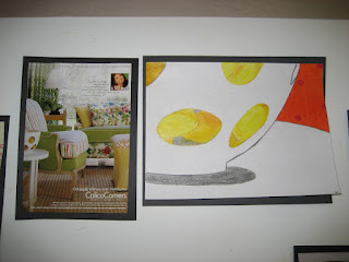
2. I am hoping we talked a little bit about composition before we began. I don't entirely remember. We did however talk about wanting the picture to be abstract. Our hope was for the viewer to try to "hunt" for where the artist's shapes came from in the original magazine page. I did this with eighth graders, so the vocabulary was within reach. We decided that enlarging and simplifying were two techniques we could apply to abstract our images. 

3. I had accumulated many interior design and fashion magazines at this point and tore out a few folders worth of images for students to select from. Students found images they liked and then "zoomed in" using an old slide that I popped the plastic out of, to make a view finder. I think they did a few sketches before conferencing with me about their final design.

You may need to click on the image to see the magazine clipping where the shapes came from, more clearly


I would definitely do this lesson again. Next time I think I would incorporate a few more color schemes to select from as well as other principles like contrast and emphasis. Looking back, I think these kids did a great job, especially with limited background in art and such a newbie teacher.