Showing posts with label line. Show all posts

Tuesday, November 5, 2013

Scratch Board Landscapes

I am so proud of my students.
Scratch board can be a challenge. Students are used to making marks that are dark and with scratching, the lines are light. (My co-worker does not do it with students until they are in Art two or three) For me, I felt like scratch board was a natural progression after working with shape and line, specifically line personality and line quality. I took it as an opportunity to review foreground, middle ground and background as well. Plus, we discussed texture and touched upon value.

We watched a couple of YouTube videos that I feel worked really well to reiterate key points.


We watched the second one first (sorry, I am just learning how to import videos). It totally caught students' attention and the music was energizing. We watched the first few seconds a second time in order to really catch how she began her scratch board. I encouraged students to take notes too. After watching the second video, I asked a few follow up questions and drew examples of hatching, cross hatching and stippling on the board. 


I think what also allowed students to be successful with the scratch board was supplying them with many, many visuals. I have collected numerous landscapes over the years, from calendars to magazine pages and postcards. These provided students with a great starting point. That, and their cellphones. Many worked from images they had or found.
I also noticed early on that many were intimidated by the scratch board. After watching the videos, we simulated drawing with scratch board by experimenting with white charcoal on black paper. It was a real challenge NOT to outline shapes before filling them in. Seeing this, I put together a Power Point for one of the following classes. 
 
I borrowed some info from here. Mainly the idea of what they might do when they really don't want to. Check out the man in profile illustration. I think that image really helped to put things in perspective for students. 
I followed that with several examples of landscapes. We discussed a couple, pointing out foreground, middle ground and background as well as scratching techniques. Finally, the last slide was a sunset with a palm tree. It looked okay at first glance but I asked students what was the big "mistake"... outlining the palm tree. I then asked, if it was their image, what would you do to improve it? This got students to think of all aspects of the page. They realized, upon further inspection, that the light source was not consistent and that areas were left black when it was supposed to be light out. 
 
I felt like a genius! Engaging students in this way made all the difference. 
The two images in this post were just the two I was able to snap. There was a huge success rate. And if anything, students realized that the creation of art is a thought process and one that takes effort and care.

From here we are moving on to observational drawing with emphasis on contour lines, followed by volumetric drawing.

If you would like the power point presentation for this lesson, please feel free to leave a comment with your email. I love sharing!


Wednesday, October 16, 2013

Exploring Visual Design Part 3

This is not the best image...
I have been a little hesitant to take photos of high school student work.
I try to be relatively anonymous about who I am and where specifically I post from etc, but I know that with just a little detective work, someone could figure it out. Its not that hard.
When I taught middle and elementary school, I felt relatively safe posting student work. They probably wouldn't find me online, nor really care that I posted their artwork. But now that I teach high school... if they really wanted, they'd find me online. (Heck, they see me in the grocery store and the football games!)  And I think that they'd take a little more ownership over their work than my little ones.
Its a conundrum that I will try to contest this year.

The image above was selected to be in our miniscule art show last spring. It is an example of organic shapes and curved lines, versus geometric shapes and angular lines.

After our exciting Elements and Principles Memory game, we started very basically with line.
We looked at slides I made from Exploring Visual Design, about line quality and line personality. I tried to reiterate the difference between outline and contour line with this exercise created by my predecessor.

We also did a few studies of our hands and shoes using contour line.
Next, students designed as many words as possible on the following sheet, also created by my predecessor but adapted by me.

The following class we talked about how an area enclosed by a line is a shape. There are also two basic classifications of shapes: organic and geometric. Students then designed two images, one using organic and curved lines, the other using geometric and angular lines. The opening image is an example from last year. At this point, almost three weeks in, students were itching for some freedom. I was pretty impressed with their creativity and even more happy that this was a great opportunity to simply demonstrate gained knowledge.

Exploring Visual Design Part 4 will be an exercise in positive and negative space.

Thursday, August 16, 2012

Scarecrows

When fall really starts to settle in, I realize how much I miss teaching elementary school. I don't think I ever even imagined myself teaching the little ones, let alone enjoying it! But there is something about experiencing their pure joy and uncensored imagination in the art room that is so rewarding. I hope to inspire my middle school kids to continue to enjoy art and use their imaginations. It can be a really turbulent time as a teenager, but art can be a great outlet.


Anyhow this fall lesson, again unearthed from my file transfer, is inspired by Not so scarey Scarecrows from Deep Space Sparkle. I did this my third year teaching, but had found Patty's website about a year before.

---side-note---
I am so thankful for the art teacher community created in the blogosphere! I did my student teaching at the high school level and there were five teachers in the building! It was also in a school that had been built within the last five years, had an amazing department head and equally awesome budget. Going from that to the only art teacher at a parochial school with not budget (that I knew of) two years later, was an adjustment to say the least! Finding people like Patty, Phyl and Mr. E. made me feel like I wasn't alone and encouraged me to provide the best art education I could. (And with the encouragement of Ms. Wilkinson (my college roommate), now at The Tale of a Traveling Teacher, I started my own blog during my third year)
------

This Scarecrow lesson was the first time I felt like I had taken an idea that I found online and really made it my own. And even more rewarding was how much fun these fourth graders had, class after class completing their assignment.


But now, two years later, I can't remember. What did we start with!?
I think we did a guided drawing the first week.
Yup, that's what we did.
We drew the face of the scarecrow, the arms/ shirt and legs however they would fit on the page. I drew different ideas on the board and had handouts at each table. I kept it simple, building on the letter 'U' and using horizontal and vertical lines. Students used black crayon.
Next we started with a plate of primary colors. We painted yellow things, then red then whatever was orange by mixing yellow and red. We followed the same idea with blue, green and brown. See More.

The next class, we used a bunch of the construction paper that had been sitting in the coat closet for years! It was faded and yellowed in spots but perfect for designing our "crops."

We again started with the primary colors and reviewed different types of line... zig- zag, curvy, diagonal etc etc. Students painted 3 (?) sheets. The next class, we tore the paper and "donated" half to the scrape bin, keeping the other half for the background.
Finally, we cut out our original scarecrows, glued them to the crop background and added some rafia for texture. I'm sure this lesson isn't original, even with the collage aspect I added. But it sure felt awesome for all of us to make something so fun! 


I think I took these photos pre rafia. Super cute none the less!

Tuesday, August 14, 2012

Symmetrical Monochromatic Paintings

Another gem from school years passed AND based on a lesson from Making Amazing Art.
I think these paintings were by fifth and sixth graders my second year of teaching, as a way to introduce color, value and balance.

1. Create a symmetrical drawing.
The original lesson called for an outline of a butterfly. I didn't want these preteens to be insulted, so we stuck to abstract, tessellated designs.
a. Fold a piece of paper in half hot dog or hamburger, and draw any kind of line that starts at the top and ends at the bottom. This was a great way to review kinds of line as well. 
b. Add five more lines to break up the two shapes. Remember to use a variety of lines to add more interest. Keeping the number of lines limited helps to not make the final composition an overwhelming design. (As it was, these took weeks!)
c. Re- trace all the lines heavy and dark with pencil.
d. Fold the paper in the opposite direction and apply pressure in order to make the lines "jump" to the other side. There are multiple methods to transfer the lines, but you don't want to spend a ton of time with retracing everything perfectly because painting takes the most time.

2. Pick a color and paint!
  • Make sure to introduce or review value and monochromatic color schemes. 
  • Remind students that for their paintings to be truly symmetrical, whatever value they paint in one shape, they must paint the corresponding shape the same value.
  • Demonstrate the process you want your students to use when mixing their own paint values and clean up procedures. 
In my room, each student gets their own "palette" or Styrofoam lunch tray and is responsible for their own materials. Tables are labeled by color and each are called to the sink by me. Clean up time has to be an orchestrated event for chaos not to ensue. My students know the routine and know my expectations. (And it took a lot of patience and learning on my behalf to figure out what works!) 

3. Retrace original lines in black if desired.


Monday, March 12, 2012

Bridget Riley and Op-Art

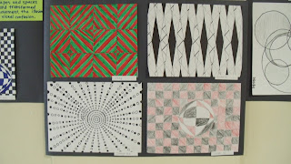
Grade 8 students recently learned about Bridget Riley and Op-Art. After reading an Art & Man article, students worked in groups of four to answer a few questions about where Riley gets her ideas and how she puts them on paper, then brainstormed a few ideas of their own. Above is our Facebook wall with examples of Op-Art, some background information and Riley's friend Viktor Vasserly. We also viewed a power point of other op- art works, pointing out what lines, shapes or spaces were repeated and how they were transformed.


We primarily focused on repeating and transforming a line, shape or space to show the illusion of depth, movement or visual confusion. I also placed great emphasis on craftsmanship. Students could decide what materials they wanted to use to add color: black or blue sharpie, markers or color pencil. Protractors, rules, compasses, triangles and tracers were also made available. It was difficult at first for some students as the possibilities were endless, but once they thought of a specific element and doodled on graph paper, things started moving.


I had multiple students ask me if I was related to Bridget Riley. Another even commented when he saw the photo on the board that he didn't know that I had dark hair before. 
What do you think?

For the record, I do think Riley looks like my mom!


Friday, March 11, 2011

visual music

with the hopes of a spring art show, I have been going back to some old activities... haha I only started teaching at a school in 2008. haha, old.

when I started though, I didn't have much in the way of tested, structured, thoughtful lessons, so I bought this book, Making Amazing Art: 40 Activities Using the 7 Elements of Art Design with the focus that year on getting down to basics (as the six classes I had that year, NEVER had art with a "real teacher.")

one of the most successful lessons I did that year was "Visual Music."
the element of art we talked about was line. how not only does it help us make a contour line drawing, but also shows emotion, movement, and even sound. that year, as I did this year, I asked students, if they had permission, to bring in their instruments. it worked out to be a band day this year! I also brought in an electric guitar and finally grabbed the attention of some of those 6th grade boys! we spent a day talking about line and sound and music, and sketching out our ideas, observing what we brought in. I even played a compilation of "abstract" music so we could "hear" many different lines.
the next class, students were allowed to choose whether their final would be watercolor painting or oil pastel drawing. we just spent about a month on a tempera painting and I know some kids needed a break from paint. those who watercolored drew with sharpie first. those who oil pasteled, outlined with black crayon first. these are the results:


after this lesson, I decided that I really like the look of the liquid watercolor and sharpie line. its nice and graphic. I hope to recreate that feel with the "For Baby" illustrations with 4th and 5th grade. I also have to apologize for the quality of pictures... I don't know what I took them by the window. it washed out some of the color. I will have to take a picture of the display I put up yesterday outside the music room.