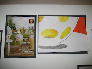
Here is a lesson from 2008!
The above display was created in December, the year I first started teaching.
Shape Hunt
Is exactly what the title entails! The basis of this lesson came from Making Amazing Art! by Sandi Henry. The forty lessons in the book are specifically tied to the elements and principles of art. I used many of the lessons as a jumping off point since my students had limited experience with art outside of crafts.
1. This lesson followed an introduction and review of color including primary, secondary and intermediate. To add to that new knowledge, we talked about color schemes, or groups. Students would decide on a color scheme for their final compositions. (I think for this one we kept it to warm or cool).
2. I am hoping we talked a little bit about composition before we began. I don't entirely remember. We did however talk about wanting the picture to be abstract. Our hope was for the viewer to try to "hunt" for where the artist's shapes came from in the original magazine page. I did this with eighth graders, so the vocabulary was within reach. We decided that enlarging and simplifying were two techniques we could apply to abstract our images.
3. I had accumulated many interior design and fashion magazines at this point and tore out a few folders worth of images for students to select from. Students found images they liked and then "zoomed in" using an old slide that I popped the plastic out of, to make a view finder. I think they did a few sketches before conferencing with me about their final design.
 |
| You may need to click on the image to see the magazine clipping where the shapes came from, more clearly |
I would definitely do this lesson again. Next time I think I would incorporate a few more color schemes to select from as well as other principles like contrast and emphasis. Looking back, I think these kids did a great job, especially with limited background in art and such a newbie teacher.


Nice lesson! Where we're you teaching where it was not culturally accepted for women to have short hair?
ReplyDeleteIt wasn't so much as not culturally accepted as it was very different. I have always taught in the same city, but this lesson was taught at a private school... bare bones material and little exposure to art other than craft.
ReplyDelete