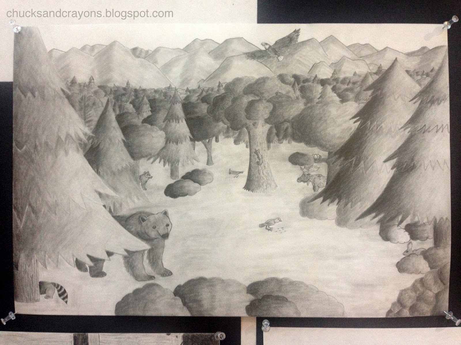
We have officially made it half way through the school year!
With just one more round of midyear exams, thanks to a snow day, our third term will be underway next week. The majority of term two was spent working with value; developing an image and executing the final product.
So much went into each of these drawings.
For many students, this was a great challenge, as this was the first assignment where they were given a significant amount of time and freedom.
To prepare, I talked about value in terms of the lightness and darkness of a surface. We completed two mini- projects, which I posted about here. We broke it down to five elements of shading, identifying full light, half tones and cast shadows of various objects.
In addition, I introduced the Rule of Thirds to help with composition.
I suppose it is more of a photography technique, but I feel like it really helps to create more dynamic images. At first it was an abstract concept to my high school students, but when I put it in terms they understood... pointed out why Instragram has that funny little "hashtag" and why the pictures always look awesome when you know how to use the grid correctly (its not to put stuff in the middle as many initially thought)... they got it!
I also developed a worksheet in addition to showing the video. It has a place to record a definition, or at least take notes, then five pictures (including one of my own photos) for students to analyze.
We also watched this video during another class and took notes on Six Ways to Create the Illusion of Space. This actually popped up on my blog roll when we started this assignment and it was perfect timing. I again had a small "viewer's guide" to along with the two minute video. I find that giving students something to write down is a good signal to them that its important information. I also made a poster to reiterate the concepts.
To develop ideas, we spent a couple of classes in our library. I encouraged students to think about broad, overarching topics. I provided a few graphic organizers, including an ABC brainstorming chart that encourages student to list something for every letter of the alphabet about a topic.
Students gathered a few reference photos to work from. Others even used their friends and phones for a photo shoot.
I really enjoy how each image is unique and speaks to the individual. The concept is the same, using value to create form and space, but each voice and style is still there.
Overall, I am absolutely thrilled with the results! I have amazing, dedicated and driven students. This was not an easy assignment by any means. Each student had to think of an idea, develop it, and push themselves to do something they had never done before. In the end, I asked for a written reflection about their work and the process they took to create it. Many commented that it was difficult but were surprised by what they could accomplish and were equally proud of their drawings.
I think we can all agree however that we are ready to enter the world of color!


No comments:
Post a Comment