Friday, August 31, 2012

New and Improved Art Room 201

 The teacher across the hall asked me yesterday if the room now felt more like my own, after a year in the building. I hadn't thought about that as I worked for ten days organizing, scrubbing and de-cluttering. I was more focused on getting the room functional, but the truth is, it does! 

For some reason I decided to empty the cabinets that contained "supplies" and organize what I found. What a mess! My goal was to stock the cabinets with everyday materials like markers, glue and colored pencils, so that I wouldn't have to go into the main supply closet (where you can't see the classroom) if we ran out of something. I think I've met my goal, but the real test will be when we really start creating. 


Since I was able to take some of the daily supplies out of the main supply closet, that needed to be reorganized too! Less clutter!

As inspired by Mrs. Impey at Art Room 104 I too spray painted some of the caddies the previous art teacher had purchased. They are way too big, and too few, to sit on the tables for supplies. So I color coded them to match two tables and my thought is that at the end of class, the tables can share the cleaning supplies that will be in the caddies.  


Excuse the blurriness, but this is a shot of the hood in the closet between my room and the room across the hall. When the building was first opened, our two rooms at the end of the building were science labs, complete with gas lines and this hood! I guess when they took out the gas, they forgot about it. My mentor, who taught in my room for five years, told me it was there and that its great for spray painting! It proved to be super convenient!


To also cut down on the clutter, I organized newspaper and magazines. I now have twelve drawers full of National Geographic, Smithsonian, Time, Newsweek, Home and Gardens, woman's interest magazines and Architecture Digest. I was also able to stash a lot of my recycled materials behind the newspaper and laundry basket of smocks.  The two boxes of National Geographic above are filled with editions from the sixties, seventies and eighties. I have removed those from classroom circulation!

 Watching Project Runway on the laptop and painting signs!


Inspired by an  image on Pinterest!
Unfortunately the original link is not working. I know a lot of visitors to my blog came to check out my old rules that spelled out ARTIST. I wanted to free up some bulletin board space and make the rules more prominent, so I created this banner. It spans the entire wall! 

I am also really proud of my Bloom's Taxonomy board inspired by Pinterest. The original link brings you to a literacy blog and has some other great ideas for elementary reading. I plan to refer to my board while going through the creative process, learning about art history, critiques and artist's statements. 
Even my desk, with my plant from home and my old red sweater in case I get cold, feels more like my space. I can't wait to get started!

Monday, August 20, 2012

Day 2 in Room 201


My classroom (and apartment) look as though I am moving. I'm not. Just organizing! 
 
Last week I went through file folders and binders of lessons and resources I have acquired over the last four years. (I can't imagine all the stuff I'll have by the time I retire, but hopefully by then I'll have a classroom to myself for more than a couple of years. hopefully.) I managed to get all of my first three years into a large binder, sectioned by grades. My stacks of paper from last year have been divided into files, ready to be moved back to school and into my one sticky file cabinet.

I am looking forward to having my own, functional work space this year, equipped with a new computer! I use a cable plugged into the headphone jack of the computer to the little stereo and play a shuffle of Pandora stations while the kids are working. It'll be so much easier now to use the player, not to mention use all the other applications.

I didn't do too much the first day other than move a bunch of furniture. Including this homemade flat file that was between the two sinks. It just didn't make sense to me to have paper storage where there was water, so I decided to try to move it.


You can see on the floor the marks left from where it was. I had to use a screw driver to loosen the years of wax build up. And once it budged, I used a broom handle as a lever and push it away from the wall. Now in front of my desk, I can use the file to store large paper and use the top to organize handouts.


Today I mainly cleaned up my sink area. I plan on putting wire shelving under the counters for cleaning caddies and some paint storage. My most favorite part of my room so far are the Keith Haring stickers I found at Ikea. They make me smile and I hope the kids like them as much as I do.

Saturday, August 18, 2012

Personal Work

We're coming up to my ten year high school reunion. I know, I know, I am young. Thank you. 
Nothing is set in stone as far as what we are doing. So far there is an informal group set up on Facebook and our class president is planning based on posted conversations and a survey.
I am looking forward to seeing people. I am terrible at keeping in touch and while Facebook has been great to see who is married, has kids, etc., nothing beats catching up in real life. 
I also want to brag about how I am actually working in the field I studied in college!

The impetus for this post however is the fact that I still have artwork from over ten years ago! I mean ten years has flown by! I shoved work from high school in a couple of brown paper portfolios, stuck 'em under my bed (in all five apartments!) and forgot about it.

I just pulled them out, covered in dust, and went through what was there. (I think I have done this a handful of times over the years, but still had stacks of work with the addition of college work) I decided to keep things based on whether or not I would use them as class examples or if I had an emotional attachment to the work. I had pages and pages of figure drawings that were getting conte crayon dust on everything and there was no good reason to keep them. I hope tonight I don't wake up in a sweat thinking I made a mistake throwing out work. I don't even let students throw work out in front of me. It breaks my heart! I ask them to take their work home to show someone before recycling.

When I first graduated from college, I dreamed of owning a flat file to store my precious pieces. I suppose I still do, but the reality is they're wicked expensive, as we'd say up here in New England, and I don't have the space. Have you ever tried to move a flat file? I bought one second hand for my last school and I was very thankful that we splurged for a mover. That thing was heavy!

Anyway, do you have work that you store at home? If it's not on display, what do you do with it? How do you decide what to keep? Then, if you get to make your own work, what do you do with it? Do you sell it?

I should also give credit to the picture: this 18x24 watercolor was done by a junior I had while student teaching.

Thursday, August 16, 2012

Scarecrows

When fall really starts to settle in, I realize how much I miss teaching elementary school. I don't think I ever even imagined myself teaching the little ones, let alone enjoying it! But there is something about experiencing their pure joy and uncensored imagination in the art room that is so rewarding. I hope to inspire my middle school kids to continue to enjoy art and use their imaginations. It can be a really turbulent time as a teenager, but art can be a great outlet.


Anyhow this fall lesson, again unearthed from my file transfer, is inspired by Not so scarey Scarecrows from Deep Space Sparkle. I did this my third year teaching, but had found Patty's website about a year before.

---side-note---
I am so thankful for the art teacher community created in the blogosphere! I did my student teaching at the high school level and there were five teachers in the building! It was also in a school that had been built within the last five years, had an amazing department head and equally awesome budget. Going from that to the only art teacher at a parochial school with not budget (that I knew of) two years later, was an adjustment to say the least! Finding people like Patty, Phyl and Mr. E. made me feel like I wasn't alone and encouraged me to provide the best art education I could. (And with the encouragement of Ms. Wilkinson (my college roommate), now at The Tale of a Traveling Teacher, I started my own blog during my third year)
------

This Scarecrow lesson was the first time I felt like I had taken an idea that I found online and really made it my own. And even more rewarding was how much fun these fourth graders had, class after class completing their assignment.


But now, two years later, I can't remember. What did we start with!?
I think we did a guided drawing the first week.
Yup, that's what we did.
We drew the face of the scarecrow, the arms/ shirt and legs however they would fit on the page. I drew different ideas on the board and had handouts at each table. I kept it simple, building on the letter 'U' and using horizontal and vertical lines. Students used black crayon.
Next we started with a plate of primary colors. We painted yellow things, then red then whatever was orange by mixing yellow and red. We followed the same idea with blue, green and brown. See More.

The next class, we used a bunch of the construction paper that had been sitting in the coat closet for years! It was faded and yellowed in spots but perfect for designing our "crops."

We again started with the primary colors and reviewed different types of line... zig- zag, curvy, diagonal etc etc. Students painted 3 (?) sheets. The next class, we tore the paper and "donated" half to the scrape bin, keeping the other half for the background.
Finally, we cut out our original scarecrows, glued them to the crop background and added some rafia for texture. I'm sure this lesson isn't original, even with the collage aspect I added. But it sure felt awesome for all of us to make something so fun! 


I think I took these photos pre rafia. Super cute none the less!

Tuesday, August 14, 2012

Symmetrical Monochromatic Paintings

Another gem from school years passed AND based on a lesson from Making Amazing Art.
I think these paintings were by fifth and sixth graders my second year of teaching, as a way to introduce color, value and balance.

1. Create a symmetrical drawing.
The original lesson called for an outline of a butterfly. I didn't want these preteens to be insulted, so we stuck to abstract, tessellated designs.
a. Fold a piece of paper in half hot dog or hamburger, and draw any kind of line that starts at the top and ends at the bottom. This was a great way to review kinds of line as well. 
b. Add five more lines to break up the two shapes. Remember to use a variety of lines to add more interest. Keeping the number of lines limited helps to not make the final composition an overwhelming design. (As it was, these took weeks!)
c. Re- trace all the lines heavy and dark with pencil.
d. Fold the paper in the opposite direction and apply pressure in order to make the lines "jump" to the other side. There are multiple methods to transfer the lines, but you don't want to spend a ton of time with retracing everything perfectly because painting takes the most time.

2. Pick a color and paint!
  • Make sure to introduce or review value and monochromatic color schemes. 
  • Remind students that for their paintings to be truly symmetrical, whatever value they paint in one shape, they must paint the corresponding shape the same value.
  • Demonstrate the process you want your students to use when mixing their own paint values and clean up procedures. 
In my room, each student gets their own "palette" or Styrofoam lunch tray and is responsible for their own materials. Tables are labeled by color and each are called to the sink by me. Clean up time has to be an orchestrated event for chaos not to ensue. My students know the routine and know my expectations. (And it took a lot of patience and learning on my behalf to figure out what works!) 

3. Retrace original lines in black if desired.


Monday, August 13, 2012

Shape Hunt

Let's take a trip in the way back machine...
Here is a lesson from 2008! 
The above display was created in December, the year I first started teaching. 

I purchased my new Mac last week and while manually transferring all my documents and photos, I unearthed this lesson, along with many other great examples of student work pre- blogging days. At the time, I had under a hundred students and taught two days a week. Art was a separate class beginning in middle school, so my sixth graders had never been to an art class their entire lives (!) and my seventh and eighth graders had never met an art teacher like me, that's for sure! (Since I was at a private school, the principal politely asked if I could take out my nose ring and cover my tattoo...) I was the youngest teacher in the building by far and had the shortest hair! That last part was an adjustment for some students as it is tradition in their culture for women to have long hair or they just had never met someone under fifty with short hair.

Shape Hunt
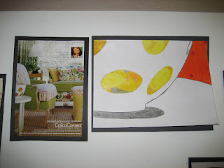
Is exactly what the title entails! The basis of this lesson came from Making Amazing Art! by Sandi Henry. The forty lessons in the book are specifically tied to the elements and principles of art. I used many of the lessons as a jumping off point since my students had limited experience with art outside of crafts.
1. This lesson followed an introduction and review of color including primary, secondary and intermediate. To add to that new knowledge, we talked about color schemes, or groups. Students would decide on a color scheme for their final compositions. (I think for this one we kept it to warm or cool).
2. I am hoping we talked a little bit about composition before we began. I don't entirely remember. We did however talk about wanting the picture to be abstract. Our hope was for the viewer to try to "hunt" for where the artist's shapes came from in the original magazine page. I did this with eighth graders, so the vocabulary was within reach. We decided that enlarging and simplifying were two techniques we could apply to abstract our images. 

3. I had accumulated many interior design and fashion magazines at this point and tore out a few folders worth of images for students to select from. Students found images they liked and then "zoomed in" using an old slide that I popped the plastic out of, to make a view finder. I think they did a few sketches before conferencing with me about their final design.

You may need to click on the image to see the magazine clipping where the shapes came from, more clearly


I would definitely do this lesson again. Next time I think I would incorporate a few more color schemes to select from as well as other principles like contrast and emphasis. Looking back, I think these kids did a great job, especially with limited background in art and such a newbie teacher.