Showing posts with label observation. Show all posts

Sunday, December 22, 2013

Hershey Kisses and Coal


I am still a little in shock that we completed the week relatively unscathed.
I pumped myself up for a long week of behavior issues, attitude and anxiety after students received their progress reports and we all waited for the holiday break. (Thats awful, but like a big game, you have to psych yourself out) Maybe I got used to the high energy of middle school students before vacation, but the week was calm while students continued to work on their value drawings.


I didn't want to be a complete scrooge, so Friday we took it easy.
I started class, when technology was working for me, with the Disney short, Paperman. If you have not seen it, go do a quick youtube search. The imagery is beautiful and the story is classic Disney. There is no dialogue, but much like the images students have been working on, it is a visual language.
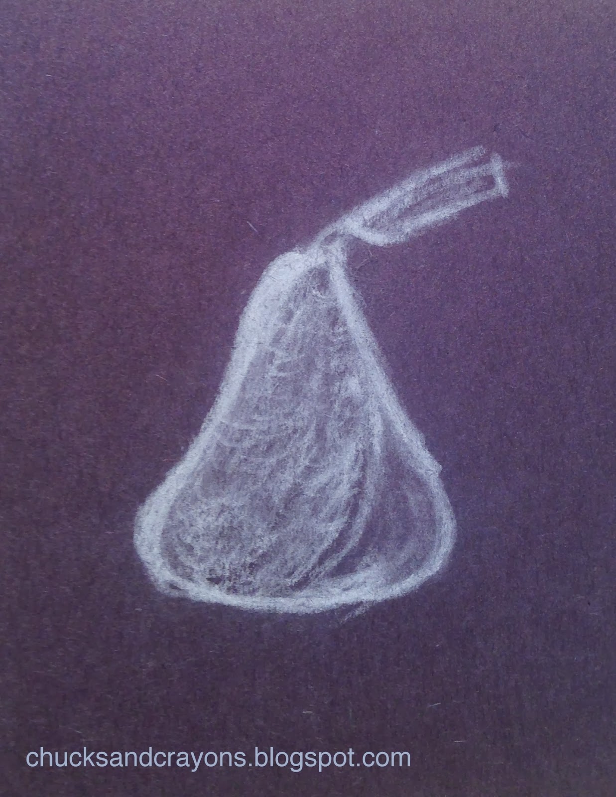
As the movie came to an end, I passed each student a baggie with three Hershey Kisses and a black piece of paper (my dorky art teacher self referred to the paper as a lump of coal... nerd). I asked students to try not to eat all the candy, but leave at least one to try to draw on the black paper with charcoal.


It was not an easy challenge. However I was not met with resistance... either students now know me too well or really didn't mind. I forgot to take pictures through out the day, so the selection above was from my last class. 

I wanted to try it out too! Thats my drawing above. 
The last twenty five minutes or so of class, students chose their own art adventure. I had these handouts and supplies available. The top half of this handout came from Tiny Art Room. I added another challenge and re-phrased a couple of things.


All in all, students were entertained, I snuck in some learning and we're now on VACATION!

Saturday, July 20, 2013

My First Oil Paintings


From inspiration to almost complete, I am super proud of my first ever oil painting. Since this last image, I have added to the pathway, the trees in the background and the growth in the foreground. I love how I channeled van Gogh, was able to capture the haze of the fog and take suggestions from my professor about layering and glazing. 

 This is probably one of my favorite photos from my two week trip. No filters, no editing, Sankatay Light actually looked this painterly. To add to the beauty, my classmates are scattered throughout the landscape, wandering, conversing and taking photos of their own.
The lighthouse was actually moved from the spot in the middle of the shot, there is a person in navy blue, to the current location. On the other side of the black fence to the right is the bluff. The erosion continues to claim the land.


There are still a few strokes of paint I would like to add to this image. However, I am very happy with the perspective and color. I am flattered that based on this image alone, my mom's boyfriend has asked me to paint him something. Just in case I get famous!


I hate this painting! It has changed rather drastically from here, although I don't have a current photo. I think I tried to do too much between experimenting with color and palette knives. It was however good a good experience for a later painting. I hope to go back and add more.


My professor saw this sketch I did, during my mid-term meeting/ critique. He loved how sketchy yet detailed it is. He could tell that I start with a medium ground, add darks and pull out lights. His challenge for the second week was to become a more "sketchy" painter. For me, that makes sense. I was so caught up in traditional American landscape painting, a la the Hudson School, that I wanted to capture every shadow and every leaf and detail. That's hard! I have always worked abstractly, but my brain thought that realistic was how I had to paint.

Given my new challenge, I wanted to try "sketchy painting" out before I started my series.  Just like college, I started this painting after 11pm. I am pretty happy with the sketchy details of pebbles created in under an hour. 

 I think this one is done. Perhaps a few highlights to pull out, but I will wait to see how the others turn out. 


I have a few more layers of pebbles and sand to complete. See the erosion from earlier photos?


Adding the reeds in the foreground just today, has totally made a difference. I still need to add a shadow to the "window" and maybe a few highlights. I hated this painting until today and am finally excited to see where it goes.

 You need to turn your computer from here on out. Sorry. Not sure what happened.


There is still a lot to be done with this image. There will be leaves on the darker trees and a wind turbine in the "window." There will also be a shadow with the window. Like the lighthouse painting, the lighter trees are meant to be images of the future. Hopefully it works out. 


Light, Water, Earth and Wind of Nantucket.

in process... the final images are due on Friday the 26th!

Saturday, March 16, 2013

Construct, Observe, Color

I mentioned a little while back that my saving graces this year have been my new work buddies and my Art 2 students. Yesterday was one of the best days this year and it makes me sad, no matter how tough it has been, that I may not be up at the high school again next year. I think there is going to be some major shifting around in our little art department. At the very least I will go back to the position that I had last year, teaching part time middle school art. I know my principal there said he will advocate for me. He reassured me that I shouldn't be worried, but nobody likes change. I will be happy to have the opportunity to keep doing what I love. And for that I am very thankful.


The images above are of a three part lesson/ unit about observation and color. This is one that I feel like I built from my own idea and am proud of the results. Traditionally, I have had eighth graders observe and study still lifes that I have constructed.


These two images are from the school where I first taught. The students are in tenth grade and I occasionally see a few at the school where I teach now. The student on the end (left) produced the image below of the white still life.


So, I took this idea and tried to step it up a little for my Art 2 students. Still life and value drawing are pretty big components of Art 1, but I didn't want to have them draw my boring old (literally dusty at this point) still lifes. I had the genius idea that with such a small class, only 15 students (!), I could bring in a bunch of recycled materials that I had been collecting and have them construct their own. There were egg cartons, paper towel tubes, broken down cereal boxes, cardboard scraps, bottle caps, newspapers, hot glue, scissors and tape. I demonstrated a few construction techniques and reviewed objective versus non- objective. Then I let students take off!

When the pieces felt balanced and complete, I had students spray paint them white. At first I had gesso, but many of the materials we used were very porous. It was like a sponge soaking up water, but the spray paint worked better to block the "pores" and cover the sculptures. Thankfully we have a vent, so we did not have to go outside.


I don't know why this is sideways, it is correct in Picasa! I get to share a pretty sweet classroom with fabulous prints and spotlights. The now white sculptures were placed under color lights and students completed at least three color studies with dry materials of their choice. If I were to do this again, I would try to find brighter color bulbs. I put them in clip lamps like the one pictured above in the front of the room, but they didn't shine very far. It was more like mood lighting. Plus, I didn't realize how much light came through the sky light, so there was not as much contrast as I had hoped for. 

As the last student finished up their sculpture and began the color studies, I reviewed color more in depth. I attempted to have groups of students become "experts" on different color schemes and then share with the class at large, but this group is not very vocal. I need to improve this part of the lesson, but I think the handout I provided was helpful.

Finally, students selected a color scheme and completed a long term acrylic painting of their sculpture in that theme. 


Sorry for the weird shadows. There were no lights in the display case.
When the painting was complete, students could paint their sculpture however they liked. I would maybe switch these last two steps. Initially I felt that keeping the sculpture white would help students see different values and then they could interpret that into color. I think that worked, but not for every student.

I have such a great group of students! There are a handful not pictured because they're still not entirely done. They are actually more of the objective pieces including a turtle, fish and wolf. What was great about this activity was that every student was successful in their own way, from the gifted student to the student with special needs. There was something for everyone, forcing some out of their comfort zones and causing students to look and think in a new way. I'm really proud of these kids and I can't wait to share some of their more recent work!

Thursday, May 10, 2012

Color Scheme and Composition Bike Painting


I love that excited feeling I get when seeing my students' work coming together. I've felt this way a lot lately, and I know the kids are feeling it too.

I found my inspiration for Eighth Grade Color Scheme Bike paintings via pinterest.
I believe the original pin was from someone's Etsy site, but I thought "Hey, 8th grade could totally do this!"

I decided to introduce students to the Rule of Thirds for this assignment. We've talked a lot this year about creating the illusion of space (perspective) but whenever there is time to "free" draw, I've noticed the sunset right in the middle of the page... you know what I'm talking about.
Having tried to introduce the concept in the past, I knew I needed help. Kids would go through the motions so to speak, but not really get it. So after scanning YouTube for what felt like hours (seriously, as soon as I thought I found a good one, there was a swear or a boob), I found a video that was short enough to keep their attention, and after a few questions, sure to drive home the point.

I brought in my own bike, and borrowed the bike the seventh grade teacher had in her classroom. I think a few years ago someone found it in the marsh behind the school. (And I thought I had weird stuff in my room!) After some observational sketches, we reviewed and were introduced to a few new color schemes, including monochromatic, analogous, triadic and split complementary. Kids could select their own schemes and were encouraged to use tints, tones and shades.
Here are a few of the first finishers: